Is my code readable? That is, I want to know if my HTML code is intuitive and my CSS style sheet well-documented.
Joshua Briley
@somecallmejoshAll comments
- @alfonsosuarezgSubmitted almost 5 years ago@somecallmejoshPosted almost 5 years ago
Nice job on this project. I agree with Mohamed's comments about using floats. There are more effective ways to lay this out, primarily CSS Grid. Flexbox is another option. You can avoid the clearfix hack by using grid. And, it's much easier to maintain once you learn the syntax.
The HTML looks good to me. The W3C validator isn't returning any errors. My only recommendation would be to have a closer look at the
<h1>tag.<h1> Reliable, efficient delivery<br> <strong>Powered by Technology</strong> </h1>I think you can make a good case for coding this like you did. When I read the two lines out loud, it makes sense that they go together and could be combined into a single
<h1>element like you have them.When I look at the design, I wonder if the intent is for them to be separate thoughts. Based on the differences in capitalization, it could be argued that the phrase Reliable, efficient, delivery is one thought, and Powered by Technology is a different one—each standalone pieces of content.
Your code is probably correct. But, this is something I would definitely ask the designer to clarify. Again, nice work on this project.
1 - @MohamedElidrissiSubmitted almost 5 years ago@somecallmejoshPosted almost 5 years ago
Nice work here. I have grown to love Tailwind over the last year and a half.
1 - @LinyThomasSubmitted almost 5 years ago
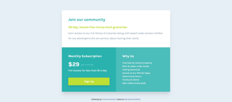
Please give a feedback on my card especially on the responsive design CSS
@somecallmejoshPosted almost 5 years agoHey there, this looks great. It loads fast, too. I think you've done a great job here. Here's some thoughts regarding your HTML here for your consideration.
In the following section
<div id="sec1">:<h2>Monthly Subscription</h2> <h3>$29 per month</h3> <h3>Full access for less than $1 a day</h3>You have an
<h2>immediately followed by two<h3>'s. While this won't return a validation error, an<h3>or any header element, should be followed by some content—like a paragraph, or list, or tabular data. So, in order to keep the HTML semantically correct, I'd recommend converting those H3's to<p>'s.You could also consider replacing the
<div class="header">with the HTML5<header>element. The<main>element could be used to include your two divs,id="sec1"andid="sec2"So, a structure like
<header>... all your header content </header>
<main>
  <div id="sec1">...</div>
  <div id="sec2">...</div>
</main>
<footer>
  ... all your footer content
</footer>
One recommendation regarding your responsive design:
You may consider using a width and a max width on your container element. For instance:
.container {
  width: 100%;
  max-width: 720px;
}
This will help ensure your content doesn't get cut off when resizing the browser.
I hope this helps. Again, super job. Keep up the fantastic work.
1


