Any comments or feedback are welcome.
Siva kumar Katari
@sivakumarkatari2020All comments
- @LJDR17Submitted over 3 years ago@sivakumarkatari2020Posted over 3 years ago
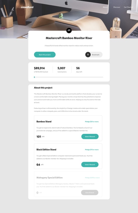
Nice work, but it is not mobile responsive, please make sure you added the styles for mobile layout too. And when the "Back project" button clicked there should be a pop-up, I think it is also missed.
0 - @iadefidipeSubmitted over 3 years ago
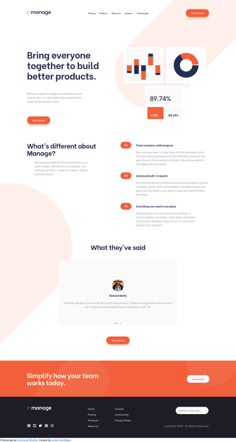
I enjoyed implementing this design 😊, the design is minimal and sleek. I learnt how to do email form validation, had more experience working with the DOM. I used swiper.js to implement your slider design.
I will love your feedback on how/what to improve improve on. 💛
@sivakumarkatari2020Posted over 3 years agoAmazing work buddy. It is looking more like to preview design ♥
1 - @RahulKumarGautam1636Submitted over 3 years ago
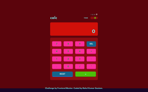
finally completed this one. HTML and CSS part was a little bit easier, the challenging part was the JS code for calculation which took my 60% of total time because i wanted the have self written and error free calculation code that works exactly same as real calculator and also prevents user from entering wrong inputs. in this process i explored bunch of properties which I have never used before such as eval(), Number.isInteger(), parseFloat(), str.toFixed() and the Error handling. feel free to criticize or suggest anything if something left to improve and also let me know if you discover any error in calculation.
@sivakumarkatari2020Posted over 3 years agoAmazing transition effects brother!
0 - @naziakabriSubmitted over 3 years ago
loved this challenge it boosted my confident when i saw it first i was like oh god this going to be a tough one but i cracked it and loved it when i was learning new topic and most importantly i cracked not fully but some what the mobile friendly webpage
@sivakumarkatari2020Posted over 3 years agoYour layout is disturbed due to the absolute sizing try to use relative units and try to use max-width and min-width properties . And you used position relative more frequently in your applications try to use it if necessary, use another alignment methods like flex-box or grid-box. Other than these entire application is good looking!
0