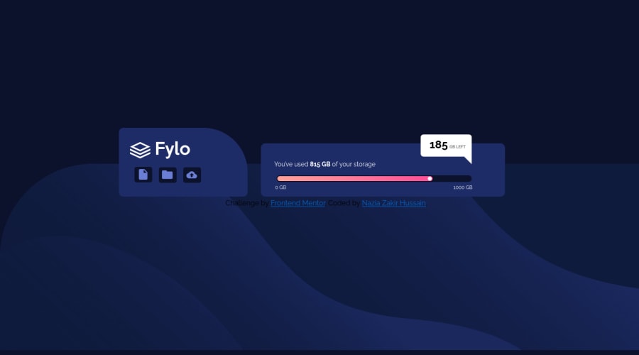
Design comparison
Solution retrospective
loved this challenge it boosted my confident when i saw it first i was like oh god this going to be a tough one but i cracked it and loved it when i was learning new topic and most importantly i cracked not fully but some what the mobile friendly webpage
Community feedback
- @sivakumarkatari2020Posted over 3 years ago
Your layout is disturbed due to the absolute sizing try to use relative units and try to use max-width and min-width properties . And you used position relative more frequently in your applications try to use it if necessary, use another alignment methods like flex-box or grid-box. Other than these entire application is good looking!
0 - @palgrammingPosted over 3 years ago
you need to put your "name" and "usage-div" in a container together and not just in the body this way you can center them together in relation to the body and control them both together
0
Please log in to post a comment
Log in with GitHubJoin our Discord community
Join thousands of Frontend Mentor community members taking the challenges, sharing resources, helping each other, and chatting about all things front-end!
Join our Discord