I'm trying to improve my documentation skills, so if you could read my README and propose improvements, I'd certainly appreciate it. 👍
Rowan Pereira
@rowanroosterAll comments
- @alberto-rjSubmitted 10 months agoWhat are you most proud of, and what would you do differently next time?
- @omk1rSubmitted 10 months agoWhat are you most proud of, and what would you do differently next time?
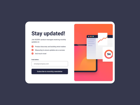
I am most proud of implementing a responsive design and effective form validation for the newsletter sign-up form. Next time, I would enhance user experience with animations and transitions, and explore more advanced form validation techniques.
What challenges did you encounter, and how did you overcome them?I encountered challenges with form validation and ensuring a responsive layout. I overcame them by using regular expressions for accurate email validation and employing CSS Flexbox and media queries to adapt the design to different screen sizes.
What specific areas of your project would you like help with?I would like help with optimizing the form validation logic to handle edge cases more effectively and improving the overall user experience with smoother animations and transitions.
@rowanroosterPosted 10 months agoIt works as it should from what I can see. I did test it out a bit, nicely done!
Marked as helpful0 - @kiaraaa123Submitted 10 months agoWhat specific areas of your project would you like help with?
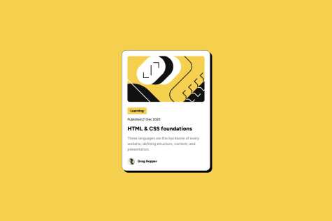
I'm having trouble with the margins for the profile image. I've made it a block element, which allows me to center it, but then removes the top margin. Any help would be appreciated. Thanks! :)
@rowanroosterPosted 10 months agoTry using padding on the
.cardelement instead of margin. But, i think if you add even 1px of padding you should start seeing the margins - this is because of margin collapse / stacking margins.if im right, check this article for more on stacking margins: FreeCodeCamp
Hope that helps, but good work! Clean code and I like the comments in the css!
Marked as helpful0 - @NyanSunboSubmitted 10 months agoWhat are you most proud of, and what would you do differently next time?
Grid-template-areas is very useful for this project.
What challenges did you encounter, and how did you overcome them?Layout because before this project I only use flex.
What specific areas of your project would you like help with?width, padding, margin and relative units
@rowanroosterPosted 10 months agoThe grid-template-area works so well, it scales down nicely - looks great all the way down to mobile!
Im going to have to try this method as well!
Well done!
0 - @SDprasanth0012Submitted 10 months ago@rowanroosterPosted 10 months ago
Nicely done! All I can comment on is the missing border radius on the image, the top and bottom left borders. You can add it to the image itself:
border-radius: 8px 0 0 8px;0 - @sakr2000Submitted 12 months agoWhat are you most proud of, and what would you do differently next time?
- Applied my knowledge of CSS and CSS-grid
- Applied my knowledge of responsive web design and media queries
@rowanroosterPosted 10 months agoYour code looks good - sizing is slightly different but it works as it should!
The only thing I could say is check out CSS custom properties (variables) might help save some time and make things a bit easier to work along: W3Schools
Also I think adding the height/width to the image itself will stop it from loosing its aspect ratio - sometimes the image container shrinks a bit to fit the image and name in the same line on smaller screens making the image squash a bit and becoming oval.
Nice work!
0 - @errbrokkoSubmitted 10 months agoWhat are you most proud of, and what would you do differently next time?
I'm proud that it works.
What challenges did you encounter, and how did you overcome them?I struggled with positioning the cards but I somehow managed to find a way using flexbox. But I am not totally satisfied with the solution yet because I don't always like the way it responds when resizing the image.
What specific areas of your project would you like help with?Ideas for positioning and responsive design.
@rowanroosterPosted 10 months agoI think for positioning at different sizes you kinda need to play around to get it just right.
For this challenge try using
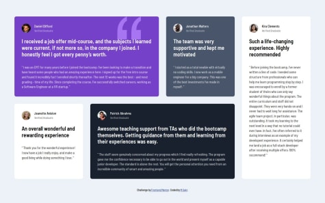
flex-direction: column;andjustify-content: center;- this will force the 4 cards to split into 3 columns with the 4th card taking up space in the middle/second column. You can then move the cards in the first and third columns down, to get the final look. If that makes sense give it a try it should work without changing any other code.I like the hover effect with the borders! if you dont want the box to change sizes on hover, you can add transparent left, right and bottom borders at the same thickness, for example:
.box {
  border: 2px solid transparent;
  border-top: 2px solid black;
}

.box:hover {
  border: 2px solid black;
}
Marked as helpful1 - @AmanKaushik975Submitted 10 months agoWhat challenges did you encounter, and how did you overcome them?
making mobile friendly , took help from internet for various methods make image responsive
@rowanroosterPosted 10 months agoNice work, interesting what you did with the image in the HTML! Have a look at the picture element for another way of handling images for different screens: W3Schools
0 - @wisdomcool11Submitted 10 months ago@rowanroosterPosted 10 months ago
Those buttons look so good, hover state works really well!
(Also like the comments you leave, i need to start doing that more!)
Marked as helpful0 - @lajfcSubmitted 10 months ago@rowanroosterPosted 10 months ago
Very good work, spot on! CSS + HTML looks neat!
If you wanna go the extra mile there is a hover state on the card that would make it look even better: Check the drop shadow of the card itself in the provided design files, the shadow grows on hover.
Well done!
Marked as helpful0 - @OgagaAkpowenre1Submitted 10 months agoWhat specific areas of your project would you like help with?
I need to improve my CSS.
@rowanroosterPosted 10 months agoYour code looks good! Without the actual measurements though, one can only eye-ball it so much.
My best advice for getting the measurements from the provided jpeg designs is to use something like adobe illustrator/photoshop or similar software to get them.
Marked as helpful0 - @samuel-aduSubmitted 10 months ago@rowanroosterPosted 10 months ago
Real nice work! Your HTML and css look so clean! Also like the mobile-first approach - the scaling works really well keep it up!!
For horizontal rules:
hr {
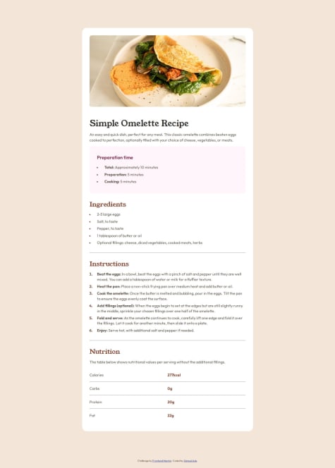
    border: none;
    border-top: 1px solid var(--color);
}
Marked as helpful0 - @ishaksonSubmitted 10 months ago@rowanroosterPosted 10 months ago
Nice work! Something I learned from my project:
li::marker {
    color: red;
}
For giving the list disc/number a color
0 - @SwanpyaethewalkerSubmitted 10 months agoWhat are you most proud of, and what would you do differently next time?
I able to make it though I might need some improvements.
What challenges did you encounter, and how did you overcome them?I still need to learn more about positioning which is the hardest challenge for me.
What specific areas of your project would you like help with?Any suggestions or improvements that I need
@rowanroosterPosted 10 months agoIt looks good, pretty close to the design. A bit more padding/height on the buttons would fill it out nicely.
Something I learned from this site that helped with my solution:
body {
    height: 100vh;
    display: flex;
    flex-direction: column;
    align-items: center;
    justify-content: center;
}
0 - @Pedro1p0Submitted 10 months agoWhat are you most proud of, and what would you do differently next time?
I am getting better and faster in understand what problems i am facing during the code, i do not made the website responsive, so in the next time i could get this on the rail.
What challenges did you encounter, and how did you overcome them?I gotted a hard time trying to align the items on the card, for some reason the card image was not getting aligned with the text, and i figured out that changing the size of the image fixed the problem.
What specific areas of your project would you like help with?I don't know if i positioned the card in the correct way, like is this correct for all types of resolutions and devices ? I dont know
@rowanroosterPosted 10 months agoThe positioning looks good, using flexbox on the body looks like a good idea and good way to get the card centered. I looked around and couldn't quickly find any reason this may be bad practice, so Ill use it in the future!
Marked as helpful1 - @PatricioZarauzSubmitted 10 months agoWhat challenges did you encounter, and how did you overcome them?
My main challenge was centering the body element, while having margin and not overflowing. What I did was setting the body element height to a calculation of 100vh - the margin top + margin bottom. Then I just used flex-box to center it.
What specific areas of your project would you like help with?I would like to reach a "pixel perfect" design, without hardcoding measurements. Also maybe simplify the css or html if possible. Any suggestions are welcomed.
@rowanroosterPosted 10 months agoNice work, and very very close to the design! I like the use of the Picture element, i need to try that next!
If you haven't checked it out you should download the Figma file to get the rounded corner values.
0 - @luiis-raceroSubmitted 10 months ago@rowanroosterPosted 10 months ago
Code looks good. Component is slightly larger than in the design with a width of 350px (max) - designs width is 320px. Component does have media queries for screens smaller than 320px - nice!
0


