Not Found
Not Found
Not Found
Not Found
Not Found
Not Found
Not Found
Not Found
Not Found
Not Found
Not Found
Not Found
Not Found
Not Found
Not Found
Not Found
Not Found
Not Found
Not Found
Not Found

Submitted

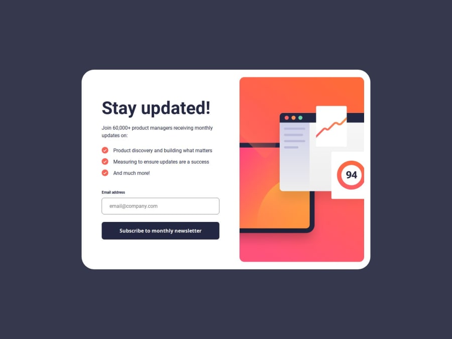
Animated Newsletter sign-up form

@alberto-rj

Desktop design screenshot for the Newsletter sign-up form with success message coding challenge

This is a solution for...

  • HTML
  • CSS
  • JS
2junior
View challenge

Design comparison


SolutionDesign

Solution retrospective


What are you most proud of, and what would you do differently next time?

What challenges did you encounter, and how did you overcome them?

What specific areas of your project would you like help with?

I'm trying to improve my documentation skills, so if you could read my README and propose improvements, I'd certainly appreciate it. 👍

Community feedback

T
Grace 29,890

@grace-snow

Posted

Really nice solution overall! I only have a few suggested improvements:

  1. Set the max widths in rem not px. This will make the layout scale correctly for people who have a different text size setting. To demonstrate go into your browser settings and change the text size to a larger vale like 32px — currently your solution would still be really narrow for those people. But if you use rem it would adjust.
  2. Instead of using role alert on the error message (it's pointless using alert role and aria live btw), wrap it in an extra element that has a unique ID and aria-live attribute there instead. The span inside can be display none but aria live regions themselves should not be display none, they should be present at all times. Then add aria-desciribedby on the input pointing to the id of the error wrapper. This means they will be programmatically linked. This becomes really helpful on bigger forms with more inputs as the errors and inputs are explicitly linked, making it much easier to understand for screen reader users.
  3. When you move between the two panels, manage focus. At the moment the content changes but the scroll position doesn't change and the new content is not announced instead give each panel, or probable just it's heading actually a tabindex of -1 and move focus there on switch of a panel to a new one.
  4. It's unnecessary to make the browser do a whole extra server call to fetch two font declarations. I recommend you move those into the main css file.

Marked as helpful

1

@alberto-rj

Posted

Hi @grace-snow!

Thank you very much for your great suggestions!

But unfortunately so far, I've only been able to implement your first two suggestions in my solution because I can understand them so easily.

Could you please give me more details on how I could implement your last two suggestions? It would certainly be a pleasure to be able to do so!

0
T
Grace 29,890

@grace-snow

Posted

@alberto-rj I already have. I'm not sure how those two can be clearer.

3 - focus needs to move when the panels change. So both headings need a negative tabindex and an ID or class you can target in JS. Then on click of the submit button in the first panel when the new content loads the focus should move to the new heading. On click of the dismiss button to move back to the first panel, focus should move to that heading instead.

4 - only have one css file not two.

Marked as helpful

1

@alberto-rj

Posted

@grace-snow thanks again for your great suggestions! Because I believe I was able to significantly improve my solution thanks to them, I can't thank you enough!

Is it okay if I mention you in the acknowledgments section of my README, expressing my thanks, similar to my past project?

1

@rowanrooster

Posted

That readme.md is great just sayin!

1

@alberto-rj

Posted

Hi @rowanrooster! I appreciate the compliment. 👍

0

Please log in to post a comment

Log in with GitHub
Discord logo

Join our Discord community

Join thousands of Frontend Mentor community members taking the challenges, sharing resources, helping each other, and chatting about all things front-end!

Join our Discord