


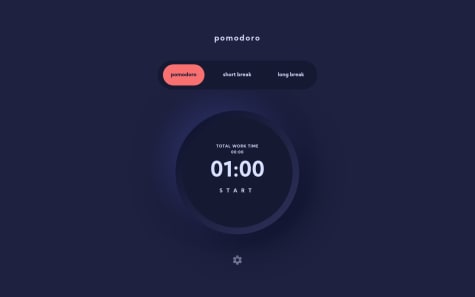

@AlbertofljSubmitted about 4 years ago
I am a Front End developer with industry experience building websites and web applications. I specialize in JavaScript and have professional experience working with React and Next.js. I enjoy building accessible, functional, and responsive web interfaces that scales.
Latest comments
- @ringmPosted about 4 years ago
Hey! Amazing job, the site looks exactly like the design. Congatulations!
Regarding your question: if you define your grid to be 1 column wide, all the child elements of the grid will fit like you want.
.container {
  display: grid;
  grid-template-columns: 1fr;
}
Keep up the good work!
0 - @mandeephubSubmitted over 4 years ago@ringmPosted over 4 years ago
Looks good! Congratulations on completing your fist project.
My only suggestions would be vertically centering the content for tablet/desktop devices.
Looking forward on seeing your next projects!
0 - @luisdevworksSubmitted over 4 years ago@ringmPosted over 4 years ago
Looks good! Just remember for accesibility reasons, you should have a
<label>for every<input>.Your form should be structured like this:
<form action="/action_page.php">
  <label for="firstName">First Name</label>
  <input type="text" name="firstName" id="firstName" value="First Name">
</form>
More info on labels here
Happy coding!
1 - @NazarkonSubmitted over 4 years ago@ringmPosted over 4 years ago
Hey Nazar, congratulations on submitting your first challenge. It's looking good! I have some suggestions to help you improve it:
- instead of using fixed margins on the
.content-wrapper, consider using something likewidth: min(90%, 1100px);andmargin: 0 auto;. With these two you'll get a fluid and centered container. - for the
header, remove theflex: wrap;. Instead, tryflex-direction: row;and when it gets too narrrow you change it toflex-direction: column; - same as the header, remove the
flex-wrapfrom.gallery-wrapperand also remove the fixed width on it's child elements, let them be fluid and stretch to the available space. once the screen get's too narrow, you can change theflex-directionon.gallery-wrappertocolumn. - also, the HTML report is yelling at you because you didn't include any
h2-h6tags inside the<section>. To avoid this problem, you can either change the sections elements for regular divs or include headings and hiding them.
Keep at it! I'm looking forward to your next project!
1 - instead of using fixed margins on the
- @drametoidSubmitted over 4 years ago@ringmPosted over 4 years ago
Hey Shubham, the site looks good! Couple suggestions to polish it:
- Consider setting the background image in css through the
backgroundproperty. There you can also set thebackground-sizeandbackground-positionto place it exactly where you need. - For a responsive layour, try the following:
.wrapper {
  display: flex;
  height: 100vh;
  width: 100vw;
}

.bg-image {
  background-image: url(../images/bg-mobile.svg);
  background-color: #0c122c;
  background-repeat: no-repeat;
  background-size: cover;
}

.container {
  width: min(90%, 860px);
  margin: auto;
}

.row {
  display: flex;
  flex-direction: column;
}

.col-30,
.col-70 {
  width: 100%;
  border: 1px solid red;
}

@media (min-width: 600px) {
  .row {
    flex-direction: row;
  }

  .col-30 {
    width: 30%;
  }

  .col-70 {
    width: 70%;
  }
}
<div class="wrapper bg-image"> <div class="container"> <div class="row"> <div class="col-30">Fylo block with logo and buttons</div> <div class="col-70">Fylo block with the bar and storage info</div> </div> </div> </div>The class bg-image should be used to place the background image.
That should take care of the main layout for mobile and desktop, I hope it helps! Let me know if you have any doubts with the code.
1 - Consider setting the background image in css through the
- @En-JenSubmitted over 4 years ago@ringmPosted over 4 years ago
Looks amazing! Exactly like the design! Congratulations :)
1