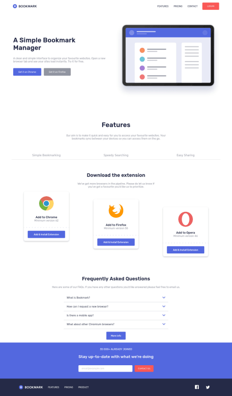
Project done. Please feel free to give feedback and constructive critisism
Reyan
@reyanshverma980All comments
- @Katleho-codesSubmitted about 2 years ago@reyanshverma980Posted about 2 years ago
You can reduce the width of the sections so that there is more space on the sides and the features is too big also, display simple bookmarking feature initially. In the FAQ section increase the font size and line height as it is too small and cramped up also, add some margin between this section and email input section. Rest, well done you have done great it looks great on smaller width
Marked as helpful1 - @Isgomes7Submitted about 2 years ago@reyanshverma980Posted about 2 years ago
You can include inline padding on nav and footer as they are stuck to side, also in get early access section the form(input and button) are too far off to the right try to get them to left. Also consider downsizing the icons in the footer section as they are too big and check their hover state else, I think you did better than me. Keep it up
Marked as helpful0

