Submitted about 2 years ago
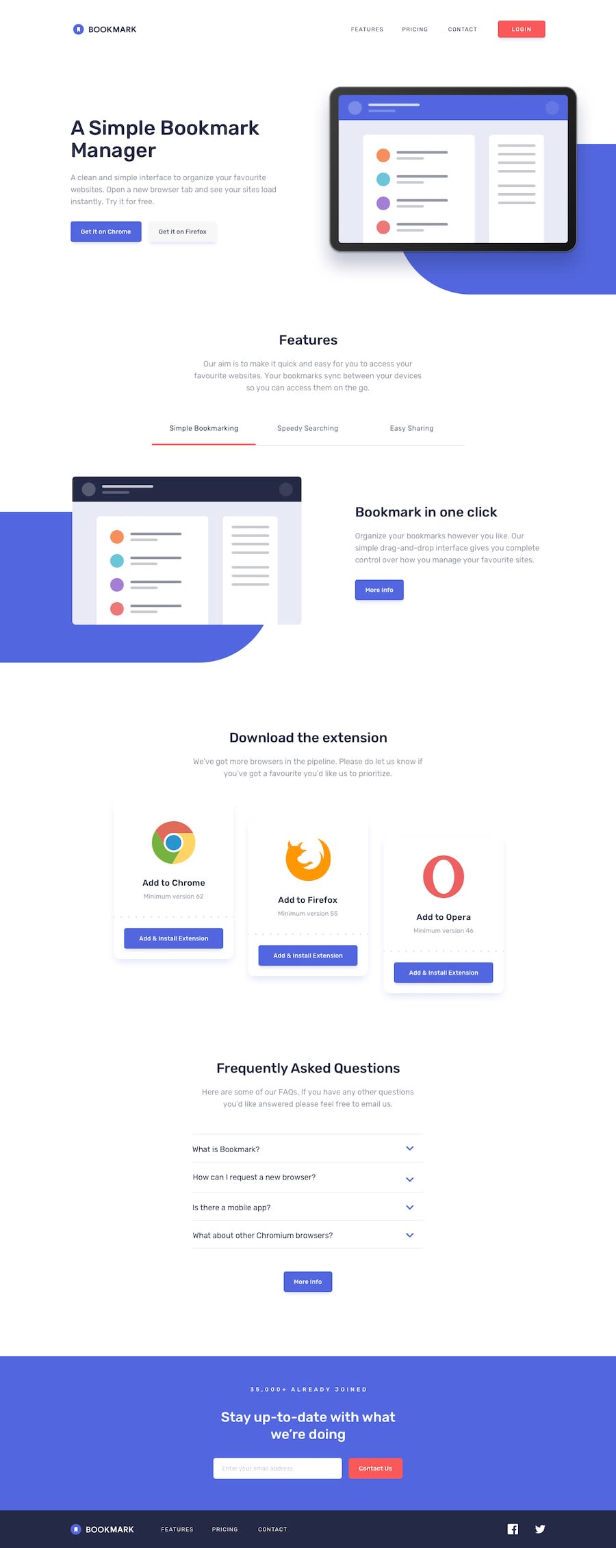
Bookmarks landing page using Sass, Javascript
@Katleho-codes
Design comparison
SolutionDesign
Solution retrospective
Project done. Please feel free to give feedback and constructive critisism
Community feedback
- @reyanshverma980Posted about 2 years ago
You can reduce the width of the sections so that there is more space on the sides and the features is too big also, display simple bookmarking feature initially. In the FAQ section increase the font size and line height as it is too small and cramped up also, add some margin between this section and email input section. Rest, well done you have done great it looks great on smaller width
Marked as helpful1
Please log in to post a comment
Log in with GitHubJoin our Discord community
Join thousands of Frontend Mentor community members taking the challenges, sharing resources, helping each other, and chatting about all things front-end!
Join our Discord
