
@shreyansh-27

pmigix
@pmigixAll comments
- @pmigix
Congrats on your first challenge solution!
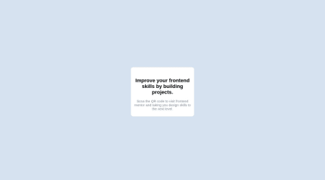
I noticed your image is missing. You can fix it by saying
<img src="./images/image-qr-code.png" alt="QR code">(./ refers to the current directory.)Good luck in further challenges!
- P@emmecee@pmigix
Congrats on tackling the challenge!
I might have some useful suggestions you can play around with!
1.Don't wrap content in unnecessary div tags, you've already done a great job of wrapping your content in separate sections, get rid of
<div class="image-container">and<div class="info-container">2.Your image shrinks before hitting the breakpoint, so to make image fill up the section add additional properties to your
.desktop-img { height: 100%; object-fit: cover; }and try setting the breakpoint at768px3.To stop your content from continuously growing on larger screens, on your
.main-containerinstead of setting thewidth:50%;, trymax-width:40rem;I hope any of this helped in some way. Best of luck in further challenges!
Marked as helpful - @AntonielAureliano@pmigix
You've done a great job! One thing I'd suggest is adding the breakpoint at
max-width: 768pxinstead so that the product-image doesn't slide under your product-description.