Skip to content
Learning paths
Challenges
Solutions
Articles
Unlock Pro
Log in with GitHub
Profile
Overview
Solutions
24
Comments
1
Paul Jin
@paulhjin
Follow
All solutions
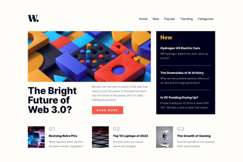
New Homepage w/HTML & CSS
Paul Jin
•
290
Submitted over 2 years ago
0 comments
3 likes
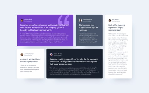
Testimonials Grid Section
Paul Jin
•
290
Submitted over 2 years ago
0 comments
2 likes
Huddle Landing Feature Blocks
Paul Jin
•
290
Submitted over 2 years ago
0 comments
2 likes
Intro Component with Sign-up Form
Paul Jin
•
290
Submitted over 2 years ago
0 comments
3 likes
Interactive Rating Component
Paul Jin
•
290
Submitted over 2 years ago
0 comments
1 like
Ping Coming Soon Page
Paul Jin
•
290
Submitted over 2 years ago
0 comments
1 like
Pod Landing Page
Paul Jin
•
290
Submitted over 2 years ago
0 comments
5 likes
Meeting Landing Page
Paul Jin
•
290
Submitted over 2 years ago
0 comments
2 likes
Equalizer Landing Page
Paul Jin
•
290
Submitted over 2 years ago
0 comments
3 likes
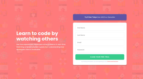
Skilled E-Learning Landing Page
Paul Jin
•
290
Submitted over 2 years ago
1 comment
4 likes
Base Apparel Coming Soon
Paul Jin
•
290
Submitted over 2 years ago
0 comments
2 likes
Article Preview Component
Paul Jin
•
290
Submitted over 2 years ago
0 comments
2 likes
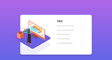
FAQ Accordion Card
Paul Jin
•
290
Submitted over 2 years ago
0 comments
1 like
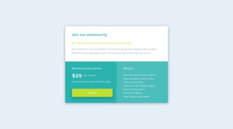
Single Price Grid Component
Paul Jin
•
290
Submitted over 2 years ago
0 comments
4 likes
Huddle Landing Page
Paul Jin
•
290
Submitted over 2 years ago
2 comments
2 likes
Four Card Feature Section
Paul Jin
•
290
Submitted over 2 years ago
0 comments
3 likes
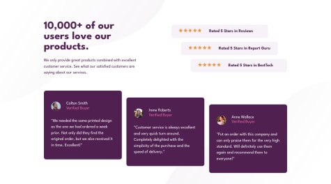
Social Proof Section
Paul Jin
•
290
Submitted over 2 years ago
1 comment
2 likes
Profile Card Component
Paul Jin
•
290
Submitted over 2 years ago
1 comment
4 likes
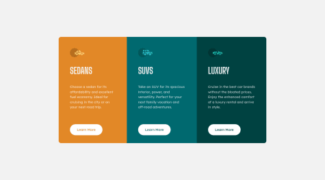
Three Column Preview Card Component
Paul Jin
•
290
Submitted over 2 years ago
2 comments
3 likes
Stats Preview Card Component
Paul Jin
•
290
Submitted over 2 years ago
0 comments
3 likes
Product Preview Component
Paul Jin
•
290
Submitted over 2 years ago
2 comments
7 likes
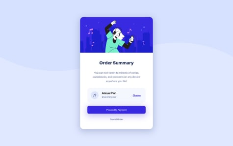
Order Summary Component
Paul Jin
•
290
Submitted over 2 years ago
0 comments
5 likes
NFT Preview Card Component
Paul Jin
•
290
Submitted over 2 years ago
0 comments
5 likes
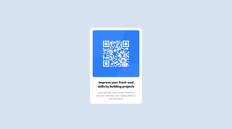
QR Code Component
Paul Jin
•
290
Submitted over 2 years ago
0 comments
3 likes
Oops! 😬
You need to be logged in before you can do that.
Log in with GitHub
Oops! 😬
You need to be logged in before you can do that.
Log in with GitHub
Oops! 😬
You need to be logged in before you can do that.
Log in with GitHub
Oops! 😬
You need to be logged in before you can do that.
Log in with GitHub
Oops! 😬
You need to be logged in before you can do that.
Log in with GitHub
Oops! 😬
You need to be logged in before you can do that.
Log in with GitHub
Oops! 😬
You need to be logged in before you can do that.
Log in with GitHub
Oops! 😬
You need to be logged in before you can do that.
Log in with GitHub
Oops! 😬
You need to be logged in before you can do that.
Log in with GitHub
Oops! 😬
You need to be logged in before you can do that.
Log in with GitHub
Oops! 😬
You need to be logged in before you can do that.
Log in with GitHub
Oops! 😬
You need to be logged in before you can do that.
Log in with GitHub
Oops! 😬
You need to be logged in before you can do that.
Log in with GitHub
Oops! 😬
You need to be logged in before you can do that.
Log in with GitHub
Oops! 😬
You need to be logged in before you can do that.
Log in with GitHub
Oops! 😬
You need to be logged in before you can do that.
Log in with GitHub
Oops! 😬
You need to be logged in before you can do that.
Log in with GitHub
Oops! 😬
You need to be logged in before you can do that.
Log in with GitHub
Oops! 😬
You need to be logged in before you can do that.
Log in with GitHub
Oops! 😬
You need to be logged in before you can do that.
Log in with GitHub
Oops! 😬
You need to be logged in before you can do that.
Log in with GitHub
Oops! 😬
You need to be logged in before you can do that.
Log in with GitHub
Oops! 😬
You need to be logged in before you can do that.
Log in with GitHub
Oops! 😬
You need to be logged in before you can do that.
Log in with GitHub
Oops! 😬
You need to be logged in before you can do that.
Log in with GitHub
Oops! 😬
You need to be logged in before you can do that.
Log in with GitHub
Oops! 😬
You need to be logged in before you can do that.
Log in with GitHub
Oops! 😬
You need to be logged in before you can do that.
Log in with GitHub
Oops! 😬
You need to be logged in before you can do that.
Log in with GitHub
Oops! 😬
You need to be logged in before you can do that.
Log in with GitHub
Oops! 😬
You need to be logged in before you can do that.
Log in with GitHub
Oops! 😬
You need to be logged in before you can do that.
Log in with GitHub
Oops! 😬
You need to be logged in before you can do that.
Log in with GitHub
Oops! 😬
You need to be logged in before you can do that.
Log in with GitHub
Oops! 😬
You need to be logged in before you can do that.
Log in with GitHub
Oops! 😬
You need to be logged in before you can do that.
Log in with GitHub
Oops! 😬
You need to be logged in before you can do that.
Log in with GitHub
Oops! 😬
You need to be logged in before you can do that.
Log in with GitHub
Oops! 😬
You need to be logged in before you can do that.
Log in with GitHub
Oops! 😬
You need to be logged in before you can do that.
Log in with GitHub
Oops! 😬
You need to be logged in before you can do that.
Log in with GitHub
Oops! 😬
You need to be logged in before you can do that.
Log in with GitHub
Oops! 😬
You need to be logged in before you can do that.
Log in with GitHub
Oops! 😬
You need to be logged in before you can do that.
Log in with GitHub
Oops! 😬
You need to be logged in before you can do that.
Log in with GitHub
Oops! 😬
You need to be logged in before you can do that.
Log in with GitHub
Oops! 😬
You need to be logged in before you can do that.
Log in with GitHub
Oops! 😬
You need to be logged in before you can do that.
Log in with GitHub
Oops! 😬
You need to be logged in before you can do that.
Log in with GitHub