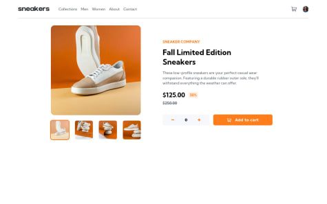
@soewaiyanagSubmitted almost 3 years ago
I learned so many things from this challenge. Let me know if there's something I can improve. And again thanks to FrontendMentor for creating this challenge.

I learned so many things from this challenge. Let me know if there's something I can improve. And again thanks to FrontendMentor for creating this challenge.
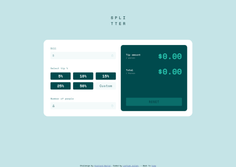
Congrats! It looks really well! I think that you need to fix the width of the cart preview on mobile screens. And I really love the checkout button! haha
Your suggestions will be welcoming. Thank you for checking it out.
Hi! You did it very well! Congrats! I think you only need to adjust the height of the card and add a box-shadow. But it looks great!
Hi! You did it very well! Congratulations! If you want to improve the UI maybe could add some styles to inputs type number to hide the arrows when you do focus on it. This could help you: https://www.w3schools.com/howto/howto_css_hide_arrow_number.asp