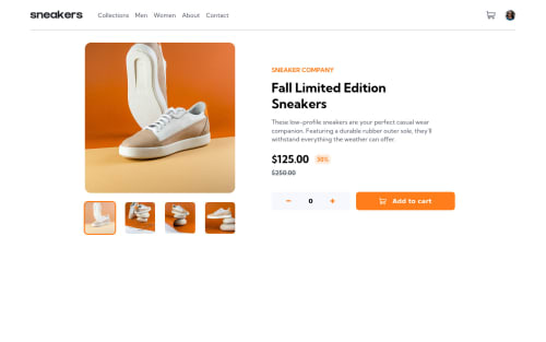
Ecommerce Product Page Using React && Sass
Design comparison
Solution retrospective
I learned so many things from this challenge. Let me know if there's something I can improve. And again thanks to FrontendMentor for creating this challenge.
Community feedback
- @ocarmoraPosted almost 3 years ago
Congrats! It looks really well! I think that you need to fix the width of the cart preview on mobile screens. And I really love the checkout button! haha
Marked as helpful1@soewaiyanagPosted almost 3 years ago@oscarvajalmora Yes. I just notice it. Thank you. I'm working on that. For the checkout button, at first, I wanted to create a new page that says "thank you for..." something like that but I can't think of anything. That's why I added rickroll. haha
0@ocarmoraPosted almost 3 years ago@soewaiyanag It was so funny and unexpected! haha BTW great job!
1 - @fadelunPosted almost 3 years ago
hi @soewaiyanag i love your design and animation, but why close nav when mobile device is not included in the navbar,did you realise?
i hope you understand what i mean
1@soewaiyanagPosted almost 3 years ago@fadelun I don't get it. Did I miss something?
0@fadelunPosted almost 3 years ago@soewaiyanag the close button it does not go down when scroll to down
Marked as helpful1
Please log in to post a comment
Log in with GitHubJoin our Discord community
Join thousands of Frontend Mentor community members taking the challenges, sharing resources, helping each other, and chatting about all things front-end!
Join our Discord