Not Found
Not Found
Not Found
Not Found
Not Found
Not Found
Not Found
Not Found
Not Found
Not Found
Not Found
Not Found
Not Found
Not Found
Not Found
Not Found
Not Found
Not Found
Not Found
Not Found

All comments

  • @GonzaSalda

    Submitted

    What are you most proud of, and what would you do differently next time?

    I feel proud of knowing what I'm doing in the code but I hope to find more challenges so I can learn from them.

    What challenges did you encounter, and how did you overcome them?

    I didn't find any problems in this challenge, it's similar to the previous QR code challenge.

    @nathan-perkins

    Posted

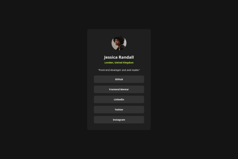
    Hello and congratulations on completing this challenge! It looks like you did a nice job with the layout of the card and getting your solution to look similar to the given design. I also enjoyed seeing you employ CSS variables. If you want to hone it in even more, reference the Figma file to get more of those details locked in!

    One thing you may want to consider as you are completing these first projects is to go ahead and incorporate semantic html. A <main> or <article> tag in place of some of your <div> tags could help improve the accessibility of your solution. Even though this project is small, these are important concepts to practice now in preparation for those bigger projects.

    I enjoyed looking at your solution, and I hope to see you post more soon!

    0
  • @carlosmarte23

    Submitted

    What are you most proud of, and what would you do differently next time?

    I’m proud of completing this first challenge because, after watching countless tutorial videos, I was able to do it without much external help. Even though it’s really simple, it gives me more confidence in my ability. I was proud of implementing CSS variables which, while not very practical in this example, are probably a must in a full project, so it’s better to get used to them now.

    If I have to do the challenge again, instead of using Flexbox, I’d use Grid for the layout to practice it more.

    What challenges did you encounter, and how did you overcome them?

    The most difficult part was getting the spaces exactly like the design and making the text on the card centered with the exact spacing. I redid the HTML layout that I had in the beginning and used a simpler one. Using only Flexbox, I managed to do it. Next time, I’d try not to overcomplicate things and keep it simple from the beginning.

    What specific areas of your project would you like help with?

    I’d like to get feedback on how to set up the dimensions and font sizes without using pixels directly. I still don’t know much about how to calculate it and which dimensions to use, e.g., em, rem, etc.

    @nathan-perkins

    Posted

    Hi Carlos, great job on completing this first challenge! Similar to you, I found that completing this challenge boosted my confidence in my ability to apply my knowledge to practical situations.

    Concerning avoiding using pixels explicitly, ems and rems are probably your best bet. Ems are based on the font size of their parent element. If the parent element does not have a specified font size, then the size will be determined by going up the tree until a font size is found. If no font size is found, then the em will generally default to 16px. Therefore, 2em would translate to 32px. If you explicitly set the parent element's font size to 12px instead, then 2em would automatically adjust to be 24px. A problem can arise when using ems, however. You use ems where the parent element also uses ems, you get a compounding effect and things can get out of control quickly. For example, lets say you set an element's font size to 2em. Based on the default size (16px), this would calculate to 32px. But if you then introduce a child element and set the size to 2em, it would be based on the 32px size of the parent element and would calculate to 64px. Because ems can get out of control quickly, rems (or "root ems") were introduced that work very similarly to ems, but they instead base their size on the root element (the html element), and will not compound the way ems do. To learn more, I found this video (https://www.youtube.com/watch?v=_-aDOAMmDHI) and this article (https://www.digitalocean.com/community/tutorials/css-rem-vs-em-units) very helpful!

    Other than that, use the screenshot and accessibility reports that FM gives you to continue refining your solution. One thing I learned as I was completing the challenge was that img elements have a display of inline by default, which adds a little extra space between the image and the text underneath it in addition to the margin/padding that you specify. This may help you align your elements more closely to the original.

    Marked as helpful

    0