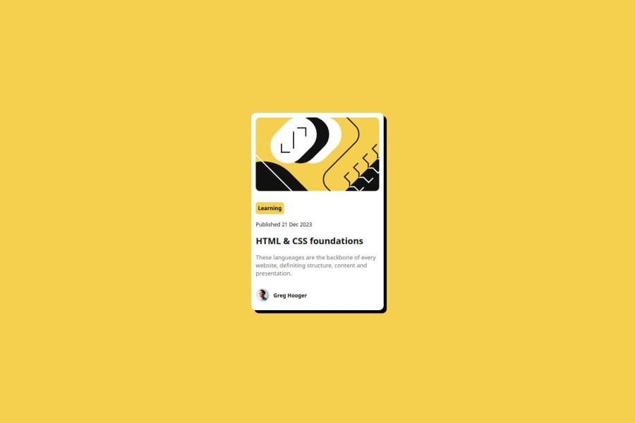
Design comparison
Solution retrospective
I feel proud of knowing what I'm doing in the code but I hope to find more challenges so I can learn from them.
What challenges did you encounter, and how did you overcome them?I didn't find any problems in this challenge, it's similar to the previous QR code challenge.
Community feedback
- @nathan-perkinsPosted about 2 months ago
Hello and congratulations on completing this challenge! It looks like you did a nice job with the layout of the card and getting your solution to look similar to the given design. I also enjoyed seeing you employ CSS variables. If you want to hone it in even more, reference the Figma file to get more of those details locked in!
One thing you may want to consider as you are completing these first projects is to go ahead and incorporate semantic html. A <main> or <article> tag in place of some of your <div> tags could help improve the accessibility of your solution. Even though this project is small, these are important concepts to practice now in preparation for those bigger projects.
I enjoyed looking at your solution, and I hope to see you post more soon!
0
Please log in to post a comment
Log in with GitHubJoin our Discord community
Join thousands of Frontend Mentor community members taking the challenges, sharing resources, helping each other, and chatting about all things front-end!
Join our Discord