P
@NavarroEmilianoSubmitted about 2 months ago

Not a bad solution and implementation. I don't understand what the hashtag React is doing in the description. You could tweak the colors a bit and check the font sizes.
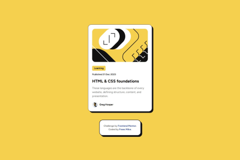
Almost flawless work. Pay attention to the positioning of the icons in the cards. Because of their positioning, they ignore the margins.
I'm proud that I didn't lose heart, even after reworking this project several times.😕
What challenges did you encounter, and how did you overcome them?There were many difficulties: after this project, I realized that I was having difficulties with adaptive design, specifically: adaptive layout of images and fonts.
It also makes it difficult to understand the clamp() function and makes it unclear how to use media queries correctly 🙄
I will deal with the topic of adaptive layout (typography, layout and pictures) and next time it will be bette!!!🤞
What specific areas of your project would you like help with?Adaptive layout
Please note that this is a card, it should be a separate component. In your case, it actually consists of two blocks that are written in the main, which is syntactically incorrect. The card on the right should be rounded. Pay attention to the dimensions, indents, etc. Your left block goes beyond its visual boundaries. Naming a folder for files "ass" is not very cultural. Why is the React hashtag present in the description?
Nice work. The repository is well structured.
I avoided using media queries to change the paddings and card width for mobile, tablet and desktop by instead using the design tools on utopia.fyi to get a clamp() that fluidly adjusts across all screen sizes. It means on tablet my solution isn't pixel perfect but this is small price to pay for less boilerplate code that ultimately ends up with basically the same result anyway.
Great job replicating the layout design. Pay attention to the not quite correct naming of classes according to BEM. Also, for semantics, you can group links to a section or an article.
Overall, a job well done. As a note - I don't see the point in using roles for main and footer.