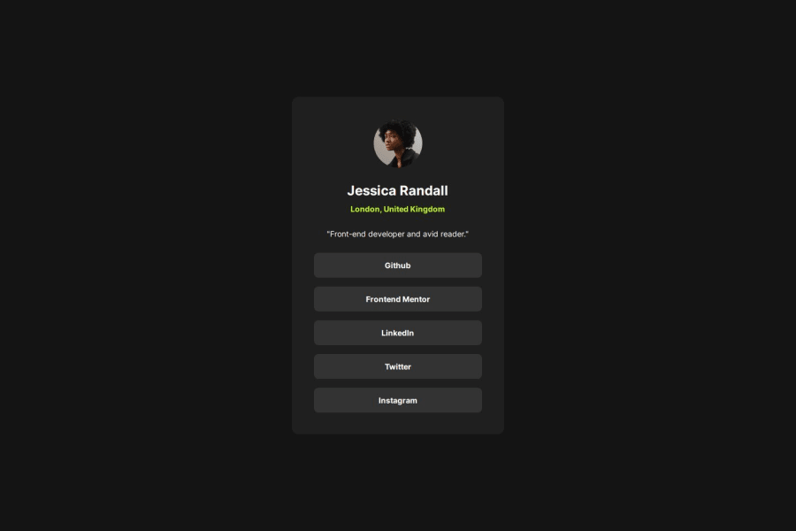
Fluid social links profile without media queries


Design comparison

Solution retrospective
I avoided using media queries to change the paddings and card width for mobile, tablet and desktop by instead using the design tools on utopia.fyi to get a clamp() that fluidly adjusts across all screen sizes. It means on tablet my solution isn't pixel perfect but this is small price to pay for less boilerplate code that ultimately ends up with basically the same result anyway.
Community feedback
- P@mykola-pyrohPosted 4 months ago
Great job replicating the layout design. Pay attention to the not quite correct naming of classes according to BEM. Also, for semantics, you can group links to a section or an article.
0P@jyeharryPosted 4 months ago@mykola-pyroh Thanks, can you give an example of which class names are not quite following BEM correctly?
0P@mykola-pyrohPosted 4 months agoSure. For example, your main has a class "card__container", which means - block__element, although according to BEM, it should be - block "card-container". After that, your section, which has the block class "card" could already have the block__element "card-container__card" class in its class. Of course, this is my personal view of the BEM documentation and I am open to discussion.
0

Please log in to post a comment
Log in with GitHub
Join our Discord community
Join thousands of Frontend Mentor community members taking the challenges, sharing resources, helping each other, and chatting about all things front-end!
Join our Discord