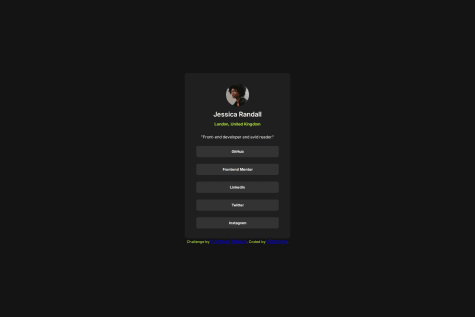
I have created this project. But can someone help me with the responsive settings. I mean that i have set the response through JS. Like on page load, if window width is more than 768 then popover will be shown and if less than the bar will be shown. But the problem is that how can it be live responsive. No need to reload page for different window layout.
mostafa-hsh
@mostafa-hshAll comments
- @Basheer-1What specific areas of your project would you like help with?@mostafa-hsh
you did a good job. i did not fully get your question, but look to my solution( it's not a very good solution and i'm not a pro by any means) i think you can get some idea. another thing to note, use less !important in you css( gain more info about cascading in css ). hope you keep up your great job bro.
Marked as helpful - @alexsantosworkWhat are you most proud of, and what would you do differently next time?
Construí o código usando display grid, o lealt ficou responsivo, porém não muito flexível, há outros elementos que podem ajudar com isso, como o auto-fill, auto-fit e minmax, que pretendo usar mais.
What challenges did you encounter, and how did you overcome them?Nesse desafio foi tranquilo, estou percebendo que, com a prática dos exercícios disponiveis, estou concluindo mais rápido os projetos.
What specific areas of your project would you like help with?Percebi que poderia ter construído o código usando elementos que permitem melhor fluidez na responsividade, usando elementos como auto-fill, auto-fit e minmax.
@mostafa-hshwell done body
- @jevcenkokozlovska@mostafa-hsh
good job body, super close to the design.
- @HamzehBajbouj@mostafa-hsh
good job man. your mobile design was perfect but as i widen the width in my browser i saw some pitfalls, nothing too serious that can not be fixed. i think the problem relies only on container "min-width" that should be around 720px and removing flex-basis. hope these feedback will be helpful. 👍
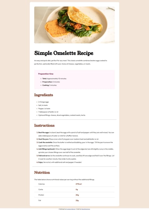
Marked as helpful - @petemac281What are you most proud of, and what would you do differently next time?
Learnt a few new things like how to colour list markers and create tables
What challenges did you encounter, and how did you overcome them?n/a
What specific areas of your project would you like help with?n/a
@mostafa-hshgood job body. so close to the design 👌
- P@Lapupeh@mostafa-hsh
well done body. code readability is perfect i enjoyed looking at it 👌
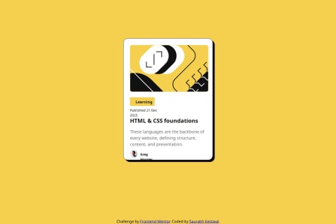
- @kestsaurav21@mostafa-hsh
well done body. one point to mention, it was better if you used the mentioned font, other than that, great job.
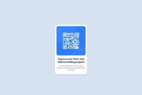
- @balogunkabir14What are you most proud of, and what would you do differently next time?
Proud to be able to proactively analyse and create the webpage for the QR code component employing everything I have learnt from HTML to CSS which I'm so happy about. In my next project, I'll like to improve on giving a more descriptive attribute name for my styling elements.
What challenges did you encounter, and how did you overcome them?The only issue I encountered was during the final stage of my project where I was trying to align the code and text content beneath it to appear almost the same with the preview image provided
What specific areas of your project would you like help with?I'd like more help in the concept of determining when to use %, PX on html
@mostafa-hshWell Done 👌. Keep it up. Things that i do differently:
- consider using flex instead of defining fix margin top and margin bottom.
- using a separate css file for styling.
Good job body


