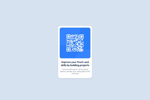
QR Code Component

Solution retrospective
Proud to be able to proactively analyse and create the webpage for the QR code component employing everything I have learnt from HTML to CSS which I'm so happy about. In my next project, I'll like to improve on giving a more descriptive attribute name for my styling elements.
What challenges did you encounter, and how did you overcome them?The only issue I encountered was during the final stage of my project where I was trying to align the code and text content beneath it to appear almost the same with the preview image provided
What specific areas of your project would you like help with?I'd like more help in the concept of determining when to use %, PX on html
Please log in to post a comment
Log in with GitHubCommunity feedback
No feedback yet. Be the first to give feedback on balogunkabir14's solution.
Join our Discord community
Join thousands of Frontend Mentor community members taking the challenges, sharing resources, helping each other, and chatting about all things front-end!
Join our Discord