Not Found
Not Found
Not Found
Not Found
Not Found
Not Found
Not Found
Not Found
Not Found
Not Found
Not Found
Not Found
Not Found
Not Found
Not Found
Not Found
Not Found
Not Found
Not Found
Not Found

All comments

  • P
    David Turner 4,150

    @brodiewebdt

    Submitted

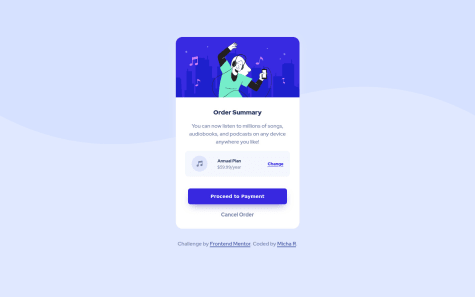
    I didn't do the changed state of the share button when active. I didn't want to spend the time using filters or changing the color of the arrow.svg. Any suggestions would be appreciated.

    Update: Fixed missing background color and incomplete Google font link info.

    Michaella 80

    @michaella23

    Posted

    looks great David!

    1
  • P
    Paul 10

    @Chasusa

    Submitted

    This is my first submission on Frontend Mentor.

    Would appreciate feedback on my HTML structure and CSS as well. I feel that I wrote too much code and could maybe have simplified it better.

    Thanks for any feedback!

    Michaella 80

    @michaella23

    Posted

    wow! it looks so close to the original. how did you choose the color for the box-shadows? I thought it would be one of the custom colors from the design file, but I couldn't ever get mine to look quite right.

    0
  • Michaella 80

    @michaella23

    Posted

    You want to use the pattern-background.svg image as your background image. There's one for mobile and another for desktop. You'll use a background color too though.

    Marked as helpful

    0
  • Michaella 80

    @michaella23

    Submitted

    I am not sure why my card looks so stretched in the comparison window. It hasn't looked that way as I've gone live with it all day... I think I have an issue with the widths I have set. Overall, I am happy that I completed it and it was looking pretty close to the original... Any feedback appreciated.

    Michaella 80

    @michaella23

    Posted

    I generated a new screenshot after making a couple of edits, and now it's shorter than the original. Lol. Probably needs a bit more tinkering, but I'm calling it a night.

    0