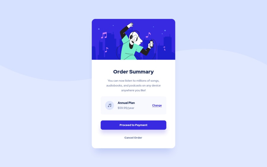
Not Found
Not Found
Not Found
Not Found
Not Found
Not Found
Not Found
Not Found
Not Found
Not Found
Not Found
Not Found
Not Found
Not Found
Not Found
Not Found
Not Found
Not Found
Not Found
Not Found

Submitted

Order Summary Card with CSS FLexbox

P
Paul 10

@Chasusa

Desktop design screenshot for the Order summary component coding challenge

This is a solution for...

  • HTML
  • CSS
1newbie
View challenge

Design comparison


SolutionDesign

Solution retrospective


This is my first submission on Frontend Mentor.

Would appreciate feedback on my HTML structure and CSS as well. I feel that I wrote too much code and could maybe have simplified it better.

Thanks for any feedback!

Community feedback

T
Alex 2,010

@AlexKMarshall

Posted

Others have commented about the CSS, so I'll focus on the HTML.

You have used a lot of divs. Instead of those you should try to use semantic elements. For instance instead of <div class="container"> <main> would be more appropriate. And <h1> should be the tag for the Order Summary title.

You've wrapped your <a> tags in a <div>. Because you've done that, you can only click on the text, not the surrounding blue background. Instead of doing that, set display: block on the <a> element and just style that, remove the div.

Marked as helpful

0

P
Paul 10

@Chasusa

Posted

@AlexKMarshall Semantic elements! Thank you, I did feel like I had too many divs for such a small projects but wasn't sure what the best way around that was.

I'll also implement proper <a> tag usage on this one!

0
Ben 770

@BenConfig

Posted

Using position: absolute; on every element is not a good idea. You will see this is a problem when you try it with larger projects which need to be responsive.

Almost all positioning can be done with a combination of grid, flex, padding and margin.

Marked as helpful

0

P
Paul 10

@Chasusa

Posted

@BenConfig Thank you, I see the future issues with position: absolute;. I realize I am not as comfortable with responsive positioning as I should be and will add that functionality to my builds.

0

@itsrafsanjani

Posted

Your design looks perfect. But did you manually calculate those bottom, left, right, top? If yes then stop doing that. Try to use flex or grid as much as possible. So that other developers can read and modify your code easily. And use href="#" if you don't know the link.

Marked as helpful

0

P
Paul 10

@Chasusa

Posted

@itsrafsanjani Thank you, I will definitely work on using flex and grid more! Thanks for the href="#" tip as well.

0
Michaella 80

@michaella23

Posted

wow! it looks so close to the original. how did you choose the color for the box-shadows? I thought it would be one of the custom colors from the design file, but I couldn't ever get mine to look quite right.

0

Please log in to post a comment

Log in with GitHub
Discord logo

Join our Discord community

Join thousands of Frontend Mentor community members taking the challenges, sharing resources, helping each other, and chatting about all things front-end!

Join our Discord