Not Found
Not Found
Not Found
Not Found
Not Found
Not Found
Not Found
Not Found
Not Found
Not Found
Not Found
Not Found
Not Found
Not Found
Not Found
Not Found
Not Found
Not Found
Not Found
Not Found

All solutions

  • Submitted


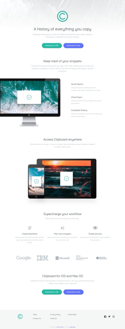
    Pretty happy overall with the end result, especially having managed to complete the challenge without pulling in any major dependencies (Bootstrap, jQuery etc.) 💪🏼

    • CSS-wise, I've taken a somewhat fluid/hybrid approach, with flexbox for mobile and tablet and then a bit of grid on top of that for wider screens
    • I decided to have a bit of fun with one of the background images on tablet and desktop by using an absolutely-positioned pseudo-element to flip it on its head 🤭
    • I ditched the fixed-top nav bar on tablet and desktop, and decided instead to use a dynamic 'back-to-top' button on vertical page scroll (> 500px) to aid navigation/UX
    • I'm thinking the font-sizes on tablet might be a bit on the small side, so I'll probably rejig the stylesheet at some point
    • I'll also look to refactor several repeated styles (e.g. for colours) using CSS variables whenever I get the chance

    All feedback welcome!
  • Submitted


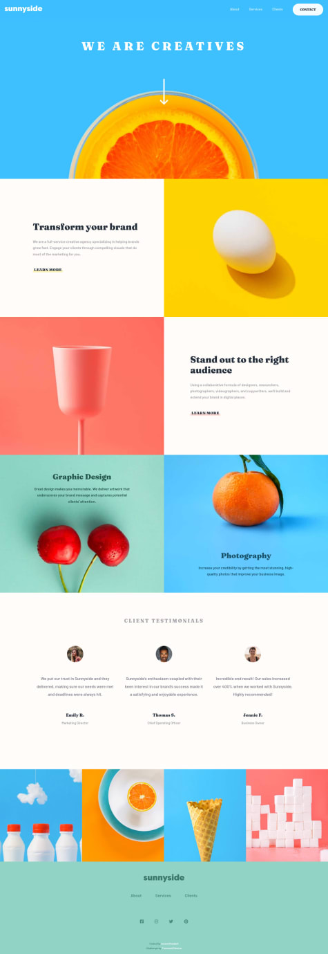
    Hey, guys. This was built using straight-up semantic HTML and CSS, with some Flexbox incorporated for desktop. I haven't learned Sass or any other way of compiling/pre-processing my CSS yet, and amn't familiar enough with Grid to have full confidence in using it. Maybe next time!

    Coding the footer was the trickiest part of this for me, on account of the uneven distribution of some of the elements on larger screens... Is there a better way I could have gone about this?

    I also haven't fully optimised this build for tablet, but I still think it looks pretty okay.

    Anyway, I'd really appreciate any and all feedback from the FM community, so thanks in advance :-)