Not Found
Not Found
Not Found
Not Found
Not Found
Not Found
Not Found
Not Found
Not Found
Not Found
Not Found
Not Found
Not Found
Not Found
Not Found
Not Found
Not Found
Not Found
Not Found
Not Found

Submitted

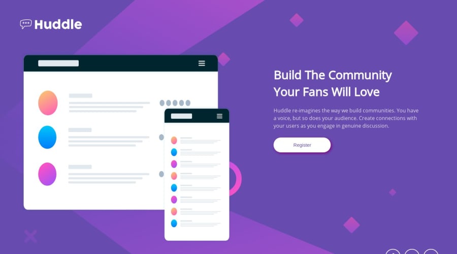
Mobile-first Huddle landing page using semantic HTML & CSS (Flexbox)

P

@loosenthedark


Design comparison


SolutionDesign

Solution retrospective


Hey, guys. This is my first time attempting a FM challenge, so all feedback welcome - especially on how to make my hero image more responsive. Thanks in advance!

Community feedback

Roman Filenko 3,335

@rfilenko

Posted

Hey, there is an issue with image, so a rule of thumb for responsive images - img {max-width: 100%;}, this way they will always have maximum width of its parent element.

Roman

2

P

@loosenthedark

Posted

@rfilenko Thanks for that tip, Roman!

0

Please log in to post a comment

Log in with GitHub
Discord logo

Join our Discord community

Join thousands of Frontend Mentor community members taking the challenges, sharing resources, helping each other, and chatting about all things front-end!

Join our Discord