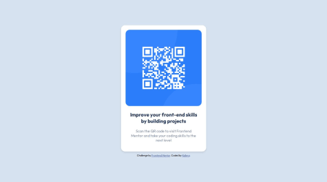
Hello, my name is Samuel (kailera is my game nickname) and this is my first experience coding a frontend challenge from FrontEnd mentor. This project proposes the creation of a responsive qr code card in html/css stack. This is a solution to the QR code component challenge on Frontend Mentor. Frontend Mentor challenges help you improve your coding skills by building realistic projects.
This qr code card adapts in mobile and desktop screens, without many changes to its structure. Basically, im mobile and large/desktop screens it has to be in center view. The style guide provide by FrontMentorChallenge specify the widths for mobile and desktop screens: 375 and 1440 px respectively. Without much difficulty, to try to respect these measurements, the size of the wrapper was defined as follows:
style.css
background-color: var(--light-gray);
width: 100vw;
max-width: var(--desktop);
height: 100vh;
display: flex;
justify-content: center;
flex-direction: column;
gap: 10px;
align-items: center;
Body has a white background, so when screen is large than a desktop measurement, the wrapper increases stops and shows the body background. This prevents the card from growing to the point of becoming useless (a QR code on a television screen that covers the entire transmitted image for example).
