Design comparison
Solution retrospective
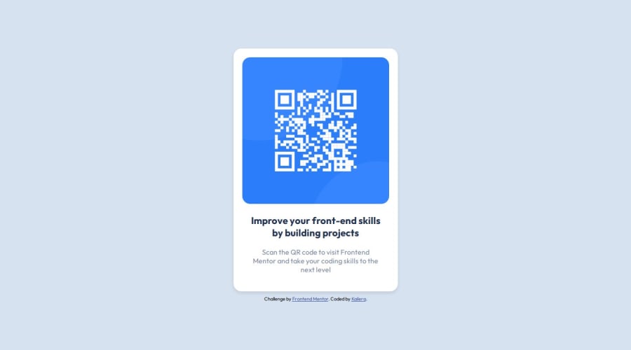
Hello, my name is Samuel (kailera is my game nickname) and this is my first experience coding a frontend challenge from FrontEnd mentor. This project proposes the creation of a responsive qr code card in html/css stack. This is a solution to the QR code component challenge on Frontend Mentor. Frontend Mentor challenges help you improve your coding skills by building realistic projects.
This qr code card adapts in mobile and desktop screens, without many changes to its structure. Basically, im mobile and large/desktop screens it has to be in center view. The style guide provide by FrontMentorChallenge specify the widths for mobile and desktop screens: 375 and 1440 px respectively. Without much difficulty, to try to respect these measurements, the size of the wrapper was defined as follows:
style.css
background-color: var(--light-gray);
width: 100vw;
max-width: var(--desktop);
height: 100vh;
display: flex;
justify-content: center;
flex-direction: column;
gap: 10px;
align-items: center;
Body has a white background, so when screen is large than a desktop measurement, the wrapper increases stops and shows the body background. This prevents the card from growing to the point of becoming useless (a QR code on a television screen that covers the entire transmitted image for example).
Community feedback
- @solvmanPosted about 1 year ago
Very well done! 🎊🎉🚀
I have a few suggestions for you:
-
⭐️ I suggest the use of semantic elements instead of just
<div>and<span>(both are non-semantic). Semantic elements significantly improve the SEO and accessibility of your project. First, the<main>landmark element represents the primary content of the document and expands on the central topic of the document. You should wrap your content in<main>.Such widgets as cards are more suited to be constructed with the<article>element, which encapsulates reusable, self-contained content. -
⭐️ Titles and headings are usually denoted by
<h1>,<h2>,<h3>, and so on. Do not skip levels of headings. Regular text is generally encapsulated by<p>.A card-like widget's most appropriate heading level is likely<h2>. Text is usually wrapped with a<p>semantic element.
With that being said, I would redo your code as so:
<body>
  <main id="container">
    <h1 class="visually-hidden">Frontend Mentor project submission</h1>
    <article class="card">
      <img src="./images/image-qr-code.png" alt="QR Code">
      <h2>Improve your front-end skills by building projects</h3>
      <p>Scan the QR code to visit Frontend Mentor and take your coding skills to the next level</p>
    </article>
  </main>
  <footer class="attribution">
      ... attribution goes here
  </footer>
</body>
As mentioned above, the
<h2>heading is the most appropriate for the card-like widget. To avoid breaking hierarchy heading rules, I added an invisible<h1>heading to announce "Frontend mentor project submission" to accessibility users. Visually hidden class (it is also calledsr-onlywhich is "screen reader only") for the<h1>:.visually-hidden { position: absolute; width: 1px; height: 1px; padding: 0; margin: -1px; overflow: hidden; clip: rect(0, 0, 0, 0); white-space: nowrap; border: 0; }Learn more about semantic HTML elements here
Please remember that block-level elements stack one on top of the other. The only element that is not block level within the card is
<img>,which could be "converted" to block level through a simple reset, which should be used almost on every project anyways:img { display: block; max-width: 100%; /* ensures images does not overflow the container */ }-
⭐️ Consider using REM units for margin, padding, and font size.
-
⭐️ Great use of custom global variables. 👍
Otherwise, very well done!🎊 Keep it up!👏 I hope you find my comments useful 🫶
Marked as helpful2 -
- P@danielmrz-devPosted about 1 year ago
Fala Samuca!
Seu projeto está excelente!
Tenho duas sugestões:
📌 Primeira: Use
<main>pro conteúdo principal ao invés de uma<div>.Tags como
<div>e<span>são exemplos típicos de elementos HTML não-semânticos. Elas servem apenas como containers para o conteúdo, mas não indicam qual o tipo desse conteúdo e nem o papel que ele desempenha na página.📌 Segunda: Também por questões semânticas, use
<h1>para o título principal ao invés de<span>.Ao contrário do que a maioria das pessoas pensa, a diferença entre os HTML headings não é só sobre o tamanho e peso do texto.
- As tags
<h1>a<h6>são usadas para definir títulos em HTML. <h1>define o título mais importante.<h6>define o título menos importante.- Use apenas um
<h1>por página - isso deve representar o título principal de toda a página. Além disso, não pule os níveis de título - comece com<h1>, depois use<h2>e assim por diante.
Essas mudanças de tag geram pouco ou nenhum impacto visual mas tornam o seu código HTML mais semântico e melhoram a otimização SEO e acessibilidade do projeto.
Espero que ajude!
Fora isso, ótimo trabalho!
Marked as helpful1 - As tags
- @addiellucena94Posted about 1 year ago
Nice work Samuel and welcome to FrontEnd Mentor
Marked as helpful0 - @kaileraPosted about 1 year ago
Thank you guys for the feedback, it It is very important for me to receive this guidance, which is why I am solving these challenges. I made the changes and created a corrections branch in git. Thank you and success to all!!
Obrigado a todos, é muito importante para mim receber essas orientações, por isso estou resolvendo esses desafios. Fiz as alterações e criei uma branch no git para receber essas correções. Muito obrigado e sucesso a todos!
0
Please log in to post a comment
Log in with GitHubJoin our Discord community
Join thousands of Frontend Mentor community members taking the challenges, sharing resources, helping each other, and chatting about all things front-end!
Join our Discord
