Not Found
Not Found
Not Found
Not Found
Not Found
Not Found
Not Found
Not Found
Not Found
Not Found
Not Found
Not Found
Not Found
Not Found
Not Found
Not Found
Not Found
Not Found
Your session has expired please log in again.
Not Found

All comments

  • Alex 10

    @justcodebruh

    Submitted

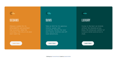
    Are there any HTML Elements in my code that do not adhere to the convention of using semantic HTML?

    In regards to adapting the Figma/Sketch file to HTML/CSS code should I have adhered strictly to the exact pixel dimensions between certain elements? (i.e. the distance between the car logos and the headings). I eyeballed the distance because I have never been pressed to do an exact one to one from mockup to markup.
    Jenna 125

    @jamby4546

    Posted

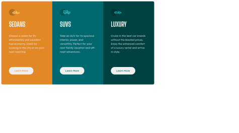
    for me it was easier to use flexbox rather than CSS grids seeing as it is only in the X direction on desktop, and Y direction on mobile.

    you can use margin: auto; for the container and usually it centers it.

    In my opinion, your media breakpoint is at too small of a screensize. for me the design started looking squished at 1200px so i put one breakpoint there, and did a smaller breakpoint adjustment at 700ishpx. this video was helpful for me to learn making CSS grids responsive!

    but overall good job at achieving the general layout of the card!

    0
  • Jenna 125

    @jamby4546

    Posted

    i had the same issue and someone commented with this documentation and it really helped explain it to me.

    0
  • Jenna 125

    @jamby4546

    Posted

    I think the general practice is that if you are only arranging boxes in the x direction, to use flexbox. If you have a layout that needs boxes arranged in the x AND y directions, use CSS grids.

    But honestly I prefer CSS grids every time even for a single line of boxes because I feel like it is easier to change if the design changes later on and it is more flexible. I am still a beginner though, its just what is easier for me to think about! It probably comes down to preference but I am not sure

    0
  • Jenna 125

    @jamby4546

    Posted

    https://www.colorzilla.com/chrome/help.html

    this extension helps if you are unsure what color to use for each part. otherwise good job!

    1
  • Bhakskar 110

    @imbhaskarn

    Submitted

    Hey guys any advice will be helpful. I have no idea how to position background image please suggest and also mention an alternavite trick to style user's name and that list with likes and photos. Thanks for scrolling.

    Jenna 125

    @jamby4546

    Posted

    there is lots of ways to display the last three stats items. I struggled a lot too. When I did it, I used bootstrap card for the whole thing and then for the list items I used display:flex and flex-direction: row. However now that I have learned a little more, I wish I had used CSS grids for the list items, or maybe even the whole layout. When I did this challenge I didn't know CSS grids and this video https://www.youtube.com/watch?v=jV8B24rSN5o really helped me learn and understand how to implement it in later challenges.

    flexbox is another option, but I for some reason really struggle implementing it. good luck!

    0