Not Found
Not Found
Not Found
Not Found
Not Found
Not Found
Not Found
Not Found
Not Found
Not Found
Not Found
Not Found
Not Found
Not Found
Not Found
Not Found
Not Found
Not Found
Not Found
Not Found

Submitted

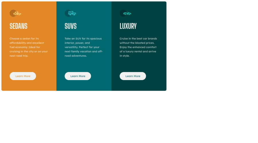
Desktop & Mobile View Card Component made w/ CSS Grid Layout

Alex 10

@justcodebruh

Desktop design screenshot for the 3-column preview card component coding challenge

This is a solution for...

  • HTML
  • CSS
1newbie
View challenge

Design comparison


SolutionDesign

Solution retrospective


Are there any HTML Elements in my code that do not adhere to the convention of using semantic HTML?

In regards to adapting the Figma/Sketch file to HTML/CSS code should I have adhered strictly to the exact pixel dimensions between certain elements? (i.e. the distance between the car logos and the headings). I eyeballed the distance because I have never been pressed to do an exact one to one from mockup to markup.

Community feedback

Jenna 125

@jamby4546

Posted

for me it was easier to use flexbox rather than CSS grids seeing as it is only in the X direction on desktop, and Y direction on mobile.

you can use margin: auto; for the container and usually it centers it.

In my opinion, your media breakpoint is at too small of a screensize. for me the design started looking squished at 1200px so i put one breakpoint there, and did a smaller breakpoint adjustment at 700ishpx. this video was helpful for me to learn making CSS grids responsive!

but overall good job at achieving the general layout of the card!

0

Please log in to post a comment

Log in with GitHub
Discord logo

Join our Discord community

Join thousands of Frontend Mentor community members taking the challenges, sharing resources, helping each other, and chatting about all things front-end!

Join our Discord