P
@kayan2004
I would like to know how can I manipulate the position of placeholder inside the input field, where the user should write his email address.
I would like to pay attention to the toggle.js script. When I toggle between elements on a screen smaller than 1400px, I can toggle only once, and to toggle again, I need to restart the server. With the screens bigger than 1400px, I dont have this issues, the toggling is working fine.
Also my HTML structure is something that I want to be carefully reviewed. I'm pretty sure that my HTML is not the best one, but I didnt have any other idea how to structure it.
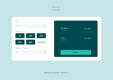
Good solution.
...
What challenges did you encounter, and how did you overcome them?Fetch the data and fill the html with JS
What specific areas of your project would you like help with?On firefox the content is in the center but on chrome the block is up to the top. I would like to know how to solve this problem.
Nice solution!
Your solution doesnt match with the design file provided from Frontend Mentor.
Here are coule things to notice: -error message should appear right above the input field, not under the field. Try to fix this using css property translate or any other property responsible for changing the position of HTML elements. -error message should appear only on bigger screens, not on the smaller screens such as mobile phone
I build it completely with Flexbox. Looking back, a combination of Flexbox and Grid might have been easier. Other than that I had a lot of fun building it.
What challenges did you encounter, and how did you overcome them?Making it responsive. Again, combining with grid might have helped here.
What specific areas of your project would you like help with?Happy about any feedback.
There are a couple issues with your solution. First of all, on a smaller screens, when you toggle and the social media icons are being displayed, I cannot see share button.
When comes to bigger screens such as desktop, you have to much space under the div with class "profile-container".
Also when I'm zomming in your component on desktop, it is not responsive, the content does not stay in it's position.
I am not proud of this. I learned I really need to understand how to optimize my layout for reactive display more.
What challenges did you encounter, and how did you overcome them?I wasn't able to understand many things like how to do a linear gradient for the colored photo.
What specific areas of your project would you like help with?Layout and code optimization. I realised how bad my layout was and stopped doing the project and plan to tackle it again in the future. I did mistakes such as not using flex:1 etc. and other interactive features.
I need some advice on how to control my layout easier.
I like your solution.
I like your solution, it follows the best practices when comes to HTML and CSS