Not Found
Not Found
Not Found
Not Found
Not Found
Not Found
Not Found
Not Found
Not Found
Not Found
Not Found
Not Found
Not Found
Not Found
Not Found
Not Found
Not Found
Not Found
Not Found
Not Found

All comments

  • Muneeb 70

    @HypeX367

    Submitted

    What are you most proud of, and what would you do differently next time?

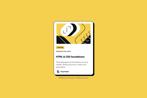
    I learned about Responsive Web Designing through this Project.

    What challenges did you encounter, and how did you overcome them?

    I primarily struggled with responsive web design and grid layout, as this was my first project using grid.

    What specific areas of your project would you like help with?

    Could you please review the layout and overall code structure of my project? I'm particularly interested in feedback on design consistency, code readability, and any best practices I may have missed.

    @imaginarygarden

    Posted

    Good job, I like the solution so far. There are some minor fixes that could be added like proper sizing or different text color. Still it is a very good solution, keep it up :)

    0
  • Alingggg 80

    @Alingggg

    Submitted

    What are you most proud of, and what would you do differently next time?

    First time using grid since I only use flex on previous challenges

    @imaginarygarden

    Posted

    Great job! I love the solution, but the sizes could be a bit bigger so it is easier to read. The font weight on the headers in grid could also use a little tuning but overall just an amazing work you did here.

    0
  • @imaginarygarden

    Posted

    I love the way you reimplemented the design. The solution is great but could use a bigger size since it could be hard to read on some screens. Overall an amazing job, keep it up!

    0
  • @imaginarygarden

    Posted

    Generally a good recreation of the original template. You should look more into the styling instructions since they would help with the right weight sizes and fonts. Some paddings could be fixed but overall well made. Keep it up!

    0
  • @imaginarygarden

    Posted

    The solution is original and well made, but unfortunately the main color pallet was changed which is not a very good sign. The buttons could use some margins and the border radius on main object is a bit off. Keep up the great work!

    0
  • @imaginarygarden

    Posted

    The project is almost identical to the original reference. The paddings inside could use a little less space but besides that everythings is great. Keep it up :)

    0
  • @imaginarygarden

    Posted

    The solution as seen in the code does not include any semantic tag structures which is overall not good. Accessibility is also under a question since some of the text is not able to fit into the main structure. The code can be reused but has some reading issues. The solution itself is almost close to the original but there are still some easy fixes to implement.

    1