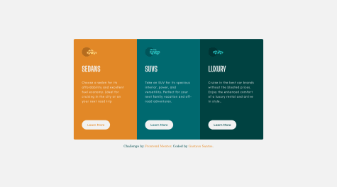
I am not sure about the background. I tried to make it to look like the design but I see it is not really correct.
Mukesh Mahato
@iammukeshmahatoAll comments
- @anhhuynh1506Submitted over 2 years ago@iammukeshmahatoPosted over 2 years ago
Hi @anhhuynh1506,
Congratulaton for completing your first project. You have done a great work.
Its seems Frontend Mentor have generated some Accessibility Issues, they are:-
- Document should have one main landmark
- Page should contain a level-one heading
You can fix this issues by using the following tips:
-
In your index.html file, you have
<section>...</section>tags, wrap the wholesectionelement into a<main>...</main>to fix the landmark issue. -
Page should contain a level-one heading: You have use a
h2tag. The heading element should be in order of (h1-h6). To fix this issue simply replaceh2withh1and use font-size property to set the size of heading.
My suggestonYou have used each element to reset its margin and padding, insted doing this, i would like to suggest to use
css universal selectorto reset. You can do this like*{ margin: 0; padding: 0; }Click Here for more information about css selector.
If you have any doubt or query, feel free to contact me.
Keep Coding!!!
Keep Learnign!!!
1 - @markuscodingSubmitted over 2 years ago
Hello, This is my first project. Please give me your feedback so i can learn more and apply from next project thankyou so much
@iammukeshmahatoPosted over 2 years agoHi Mark!
Your work looks good, but there is some accessibility issues report generated by Frontend Mentor.
Issues:
- Images must have alternate text
- Document should have one main landmark
- Page should contain a level-one heading
- All page content should be contained by landmarks
You can fix these issues by following ways:
-
add alt attribute to img tag. eg:
<img class="image-qr" src="images/image-qr-code.png" alt="qr-code"/> -
Put you
<div class="qr-card">into a <main> tag or <section> tag. -
You have used <h2> tag, instead you can use <h1> tag and set the font-size as required.
-
You have a
divof classattribution, put the div in *footer tag.
By following the above steps you can fix the accessibility issues. You have some mis-matched in image size which can easily be fixed.
You can have a look to my solution. click here to live preview my solution.
If you have any doubts or questions do not hesitate to ask.
Keep Coding! Keep Learning!
1 - @Mike-DaveSubmitted over 2 years ago
I am open for any feedback... thank you
@iammukeshmahatoPosted over 2 years agoHi Michael,
Your work looks pretty good. There is an accessibility issues generated by Frontend Mentor. It is generated because you have used <h3> tag, Your page should contains at least a level-one heading i.e <h1> tag. And then set the font size according to the design in style.css.
Your can fix this issue by simply replacing you <h3> tags with <h1> tag.
Your image height is smaller than the design, it should be
height: 288px;It would be better if you add box-shadow to the card. you can add box-shadow as
box-shadow: 0 4px 12px -4px rgba(0, 0, 0, 0.2);You can have a look to my solution. Click Here for live preview of my solution.
If you have any doubts or questions, feel free to ask.
Keep Coding!
Marked as helpful0 - @yud11zSubmitted over 2 years ago
All feedbacks are welcome, thanks in advance.
@iammukeshmahatoPosted over 2 years agoHello Mr. Yudiz, your design is quite similar to the challenge but it seems some miss-matched. The font weight of "Order Summary" is not similar to the challenge also there is more space between the text in the "subscription" division. The height of the "Proceed to payment" bottom should be a bit greater than than what you have given. You can take reference to my design. Here is the link of my github: https://github.com/mukeshmahato843/orderSummary
I hope this will be helpful for you!!!
1 - @GushigustavoSubmitted over 2 years ago
Send me feedback. :-))
@iammukeshmahatoPosted over 2 years agoHello Gushigustavo, your design is good, but i think you haven't used the font given in style-guide.md file. Also the height of the div a bit mis-matched. here is my design you can check it. https://github.com/mukeshmahato843/3-column-card
Marked as helpful0


