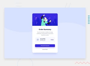
Design comparison
Solution retrospective
All feedbacks are welcome, thanks in advance.
Community feedback
- @Harshi786Posted over 2 years ago
Hey! Congrats on completing the challenge.
Your solution looks good but few more tips to make it perfect.
-
For background image, Change background size from cover to contain.
body {background-size:contain;} -
Add hover to links and buttons.
- For link.
a:hover { text-decoration: none; opacity: 0.8; } - For payment button.
.btn-pay:hover { opacity: 0.8; cursor: pointer; } - For cancel order button.
.btn-cancel:hover { color: #1f2f56; cursor: pointers; }
- For link.
-
Try mobile view as well.
Hope this helps.
Marked as helpful1 -
- @iammukeshmahatoPosted over 2 years ago
Hello Mr. Yudiz, your design is quite similar to the challenge but it seems some miss-matched. The font weight of "Order Summary" is not similar to the challenge also there is more space between the text in the "subscription" division. The height of the "Proceed to payment" bottom should be a bit greater than than what you have given. You can take reference to my design. Here is the link of my github: https://github.com/mukeshmahato843/orderSummary
I hope this will be helpful for you!!!
1
Please log in to post a comment
Log in with GitHubJoin our Discord community
Join thousands of Frontend Mentor community members taking the challenges, sharing resources, helping each other, and chatting about all things front-end!
Join our Discord
