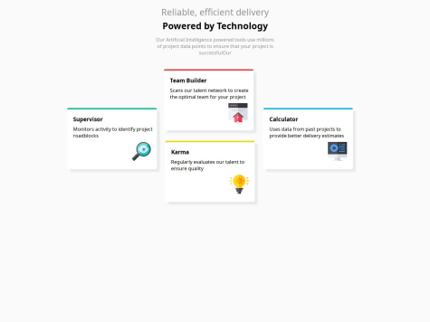
i'm not able to make responsive website where i'm doing wrong suggest me
hashiharis
@hashiharisAll comments
- @darkshadows02Submitted 10 months ago@hashiharisPosted 10 months ago
@darkshadows02,
Your solution looks really amazing. Great Job 🎉
For making it responsive:
- You can also use flexbox to work with it.
- You can use a grid layout and using media queries with
max-widthfor smaller screens you can position them usinggrid-areaproperties.
For accessibility and SEO reasons:
Make sure you use heading tags in their logical order from h1 to h6 Here is an article that might help you
Marked as helpful1 - @Kintama1Submitted 10 months ago
-I would appreciate feedback on code efficiency: Whether certain elements are redundant, whether the code is clear at what it does
- How to make this for both web and mobile versions?
- What do you recommend I look at next
@hashiharisPosted 10 months ago@Kintama1,
Great Job! Your design looks amazing !
I would like to suggest some best practices:
-
In the HTML markup always use heading levels in the order of h1 to h6. For eg: The title is the first heading so the first heading must be h1. Also for next headings, it's recommended to not skip the heading levels. So in your code for author name, instead of using h4, it's recommended to use h2. You can style both of them further using font-size and font-weight.
-
To make it responsive and use for for both web and mobile versions - my personal approach is to design it mobile first and then use media queries to adopt for larger screens.
-
I would also suggest as a next step to look into using css units like %, em, rems, vh, vw . This helps a lot in responsiveness on a deeper level.
Hope this helps and Happy Coding !!!
0 - @theunicornsteakSubmitted 10 months ago
-
I am always a little unsure how/when exactly to use a div to contain a certain section of html. I initially started off by enclosing each section of html in a div (so I initially had I believe 5 divs). That felt like a lot and styling became a little more difficult. So I reduced the amount of div to what is currently on there (3 total divs) and found that much easier. Is there any guidelines or best practices when using divs?
-
Im unsure how exactly to get the QR Code image to be closer in line to the edges of the .card than it currently is. I was playing around a little bit with width percentage and padding but wasn't getting what I wanted.
@hashiharisPosted 10 months agoHi Nick, Great Job!
- Your solution looks great. I also liked your approach of using flexbox to solve it.
- I hope using the width of the card component as a percentage would be good, instead of using pixels.
- Also may be you can try adjusting the padding-inline of the card component using 'em' units so that it would ensure you equal spacing, without compromising the responsiveness.
- Your approach to set the qr-code image width in percentage in my opinion is not a problem.
- Hope this helps you
0 -


