Hardikk Kamboj
@hady68All comments
- @AliAshour2Submitted about 1 year ago@hady68Posted about 1 year ago
@AliAshour2 Good Effort on the challenge! Just these few changes would make it very closer to the given design :
body :
height: 100vh;

container :
    width: 100%;
    height: 100%;
    display: flex;
    flex-direction: column;
    align-items: center;
    justify-content: center;

box-container:
width: 300px;
Hope this helps!
Marked as helpful1 - @feldspar58Submitted about 1 year ago@hady68Posted about 1 year ago
Hey @feldspar58 Great effort on the design, here are a few suggestions to make it look closer to the design given.
-
You can work on the spacing inside the card, that is the margin between the image and the heading.
-
You can import the given font and apply it to the body
@import url('https://fonts.googleapis.com/css2?family=Outfit:wght@400;700&display=swap'); body { font-family: 'Outfit', sans-serif; background-color: hsl(212, 45%, 89%); }- Similarly, for the paragraph you can use the same font family and also add the property of line height to add space in between the paragraphs, you can play around with that.
This is a great start, keep improving!
Marked as helpful0 -
- @umPoucoCansadoSubmitted about 1 year ago@hady68Posted about 1 year ago
Hey @umPoucoCansado I think you uploaded a different challenge, please check.
0 - @sina-ebrahimiSubmitted about 1 year ago
All feedback is welcome
@hady68Posted about 1 year ago-
The development looks great!
-
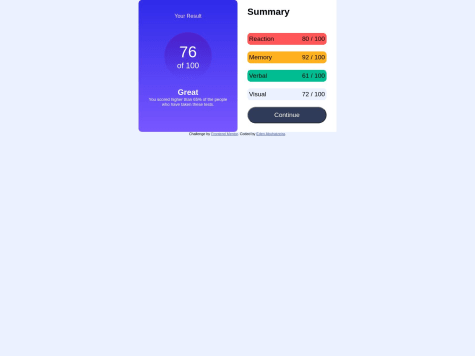
Just one feedback: In the desktop version, in the body tag, you can center the div and make it similar to the design that was provided by making these changes.
height : 100vh width : 100%
Marked as helpful0 -
- @skadankaSubmitted about 1 year ago@hady68Posted about 1 year ago
@skadanka Hello Eden, your development looks good, to make the content positioned in the center, you can apply the following CSS styles to the body tag:
body {
   height: 100vh;
   display: flex;
   justify-content: center;
   align-items: center;
}
Marked as helpful1


