What are you most proud of, and what would you do differently next time?
The accessible keyboard navigation (tab, space, arrow keys) I updated since doing this project a while ago.
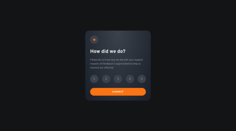
I also redid the html for the rating system to make it more semantic.
I really like your approach on implementing keyboard navigation. I tried to figure out your shortcuts by myself -- without checking the source code -- and have some thoughts on user experience here:
I would expect to select a rating with the corresponding number key
I would expect to select a focussed rating by pressing 'Enter' -- maybe this could lead to auto-focus on "Submit"?
It is possible to switch to the lesser or higher rating by arrow keys -- this I would not have tried without checking the code -- why can I not navigate through the whole scale by arrow keys but only to the direct neighbour of the current selection? Is this a bug?
Please don't get me wrong -- these are just thoughts and suggestions :)
I felt inspired by your use of ARIA roles regarding the radio button group. Further research showed me that apparently it would also be an option to only use semantic HTML as shown here within the last example: https://developer.mozilla.org/en-US/docs/Web/Accessibility/ARIA/Roles/radiogroup_role
Last but not least some tiny remarks:
The hover effect on your 'Submit' button is missing, also the text color should be black
The text color of the ratings on hover and select should be black, the background on select should be white
I am sorry that I can not help you with your specific questions since I am struggling at similar topics. But I like to suggest one little improvement on your solution: Setting the border radius of the image slightly smaler than the one of the card does lead to a better fit of the image into the card.