


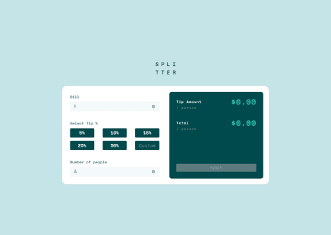
@ZxjklpSubmitted 19 days ago
Latest solutions
- Submitted 12 days ago
responsive frontend quiz using react
- HTML
- CSS
- JS
allowing the user to use keyboard as navigation in the app and also the option logic. like how the user sees if the option selected is correct or not instead of just seeing everything that is not correct.
- Submitted 2 months ago
Responsive article preview component with javascript,css and html
- HTML
- CSS
- JS
i'd to see if there is a better approach using javascript to create the popup for both mobile and larger screens.
Latest comments
- P@MathiasHun1Submitted about 2 months ago@guardianprimePosted about 1 month ago
The password generator text at the top gets cut off on larger screens(> 1200px width). Also on mobile devices a little side padding outside the calculator would look a little better(just my suggestion). The input element is supposed to be disabled to stop users from being able to type inside it. just add the disabled attribute to the input tag.
Marked as helpful0 - @DariaRomanowskaSubmitted about 2 months ago@guardianprimePosted about 2 months ago
Error handling bug
Your error handling has a bug. it logs "persons must be more than 0" to the console. I don't think that is ideal for an average user. You could use a span text to show the message when the user does not add a number or when the number is less than zero. something like toggling the display property with css for different states.
Marked as helpful0 - @IbrahimMuradSubmitted about 2 months ago@guardianprimePosted about 2 months ago
Looks and works nice on my computer but on smaller devices(such as iphone 12 pro) the content of the page overflows and then the browser adds a scrollbar at the bottom. i think a overflow-x: hidden; in the body style will help rectify this.
0 - @Lukas3162000Submitted about 2 months agoWhat are you most proud of, and what would you do differently next time?
I'm proud of my first webcomponent in which i used JS to make it interactive.
It took me quite a while and i had to stop midwaythrough so i don't really remember all the details, pains and so on.
What specific areas of your project would you like help with?I'd love to get some help on the Image-part. I couldn't make it fit ontop of the viewport in the mobile view and i'm also not quite happy with the way it behaves in the desktop view.
@guardianprimePosted about 2 months agoToo solve the desktop view responsiveness i think it would be better to give it a defined height of atleast 70% of the browser height or laptop screen height. or you could just use pixels and then fine tune it for different widths and heights using media queries.
0 - @VictoryobasiSubmitted 3 months ago@guardianprimePosted 2 months ago
for your popup i think using a div would have been better than using a p tag. also the triangle in the popup covers the facebook image a bit. you should have reduced the length of it. maybe border-bottom: 15px; and adjusting the transparent right and left borders to match it to give you a smaller triangle or better still you could have put it behind the box using z-index. The mobile screen implementation looks different from the design.
0