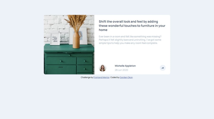
Responsive article preview component with javascript,css and html


Design comparison

Solution retrospective
I added Javascript to a frontend project!!!. hopefully it's going to be the first of many. I think my implementation might not be very efficient especially the Javascript. I will review the code when i get more knowledge of Javascript.
What challenges did you encounter, and how did you overcome them?responsiveness for different screens was so challenging especially devices like the samsung s8. media queries and good use of clamp() in my css helped.
What specific areas of your project would you like help with?i'd to see if there is a better approach using javascript to create the popup for both mobile and larger screens.
Community feedback
- P@jonatan-samuelssonPosted 23 days ago
Hi!
Well done, good for you getting the JS to work.
A few comments and suggestions:
Layout, design, CSS
- Comparing your site to the designs, your element is different in size and spacing. Try to get fonts, padding and margins to match the design by pulling it up side by side to your page to compare them.
- One major problem with the above is that your component extends the whol viewport width at some sizes, which means part of your share-toast will overflow the screen when activated.
- Don't use your main as your component. Rather make a class like "article-preview-card" or something, which then goes inside the main. With your current setup, your component is always 70vh high wchich looks really strange, especially on mobile sizes.
- Your media query breakpoints are a bit awkward. Going from mobile to tablet for instance causes a kind of wierd layout. A dugesstion for positioning your content is to have your main wrapper be 100% wide and give it a min-height of 100vh, then set it to flex, justify-content: center and align-items:center. That way your component will always be in the middle of the page. Also: you have not made separate tablet and desktop layouts, which was in the design spec.
- Your use of clamp() isn't working in some places. For instance, .profile-div has
height: clamp(15%, 22%, 30%);, which will always become 22%. Clamp will use the middle value (oft referred to as 'preferred' value) as long as it doesn't compute either to smaller than the first (min) value or larger than the last (max) value. If all values are the same unit clamp won't work at all. - The share-toast looks good, almost like the design. You should have another look at font color and text-transform though, as the "share" text in your page is white and not uppercase.
Javascript
You've made it work, which is really good. Well done. There are simpler ways though, as you don't need all the screen size checks in here, and you can basically just toggle the share-toast visibility and the share button active classes on and off, and then restyle the share-toast for different screen sizes using css instead. If you want an example, here's how I solved it: GitHub repo | Live Site
Marked as helpful0

Please log in to post a comment
Log in with GitHub
Join our Discord community
Join thousands of Frontend Mentor community members taking the challenges, sharing resources, helping each other, and chatting about all things front-end!
Join our Discord