@CleanCoderKSubmitted about 3 years ago
Warmly welcome for any comments and suggestions

Warmly welcome for any comments and suggestions
It is nice but you have some serious issues with the fonts. keeping that aside everything was nice but you can it more nicer. check out my solution hope it will help you a little bit❤️and yeah keep up the good work.
Can i make it better? please review it, it would be helpful!! Thanks :)
hey, everything is nice. do some more practice and improve these things. try to improve the font size, make the font bold. and to make your background make like the challenge picture. make the background on the body tag. set the background picture in CSS. set it as background-img=url(../images/background.....) then set the background as no-repeat, set the background-position on top, and adjust the height and width of the background. make the background as height:100vh. do those and I hope it will help you a lot. thank you.
let me tell is it perfect or not?
It's nice and everything is quite well done. although you can improve it a lot. if you want to improve it do check out my solution. I hope it will help you a lot and give you a basic idea of how it's done. however quick note. set the body background image and make the background image cover and position top and make the background color as given in the style. readme file. I hope it will help you improve.
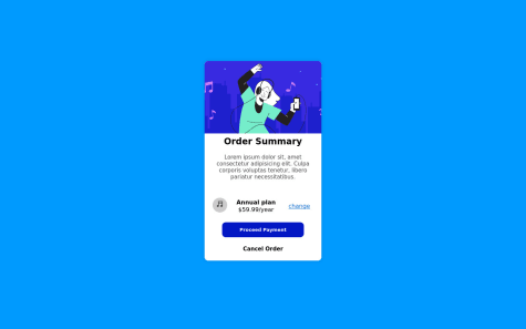
What do you think is the cleanest way to structure the section with the icon, annual cost and link? in separate divs or in the same (as I have currently)
you could have improved it a lot. if you want to have a basic idea of how to improve it check out my solution. I hope it will be very helpful to you. it will give you an idea of how to set background. how to make it responsive and how to align content inside the card. so do check out my solution. I hope it will help you even if a little bit.
Primarily looking for feedback on how I am sizing the card and the inner music image, and any feedback for how make the page responsive more responsive. Thanks!
you're designing is nice but you can make it look more good. Here is some stuff which if you've applied it would look more good. first, whenever you start doing any task don't write you're code under the body tag instead write it inside the main tag <main><main/> it would specify you're working more. secondly, you can make the card size small and fit it in the middle so that it would look nicer and it would beautify the webpage. third, the div where you have written the pricing. you should make the border-radius a little less and make the background a little more transparent so that it would give an aesthetic vibe. fourth, last but not the least. you could have made the fonts a little small on the mobile version because it looks tremendously big there. so I hope these things will make you're working more efficient and make it better. hope you find it useful.