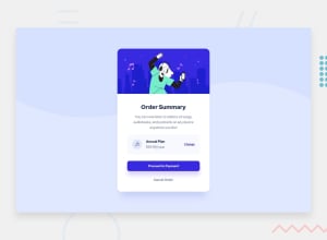
Use a music icon from ionicon.com which is best for every begginers.
Design comparison
Solution retrospective
let me tell is it perfect or not?
Community feedback
- @faiyaz-rahman13Posted about 3 years ago
It's nice and everything is quite well done. although you can improve it a lot. if you want to improve it do check out my solution. I hope it will help you a lot and give you a basic idea of how it's done. however quick note. set the body background image and make the background image cover and position top and make the background color as given in the style. readme file. I hope it will help you improve.
Marked as helpful1 - @Sami-21Posted about 3 years ago
Great job my friend. However, try to use the resources provided to you. Use the color codes for the button + text and the svg file for the background. Make sure it is align perfectly. Keep your head up and Good luck in your learning journey
Marked as helpful1 - @afrusselPosted about 3 years ago
As a first project good work. There is some width and height mismatch on the card. I would like to request you please take a look at my solution it may help you to find your issues
1
Please log in to post a comment
Log in with GitHubJoin our Discord community
Join thousands of Frontend Mentor community members taking the challenges, sharing resources, helping each other, and chatting about all things front-end!
Join our Discord
