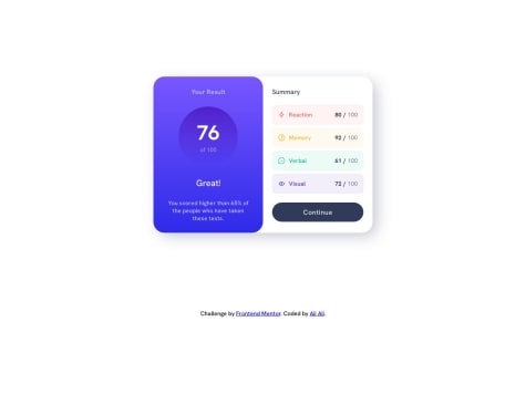
- How would you improve this?
- Is there anything that I did poorly / inefficiently?
- Any general feedback / comments / questions?
Erlyn Ascarate
@erlynascarateAll comments
- @KMArtworkSubmitted over 1 year ago@erlynascaratePosted over 1 year ago
Hello, It overflows a bit horizontally between 500px and 885px (I don't know how to fix it, sorry)
Also, it overflows vertically (when the screen is less than 740px). You could do this:
min-heightinstead ofheight#gamescreen{ ----min-height: calc(100vh - 4rem); ----padding: 2rem; ----text-align: center; ----background: $BGGradient; ----display: flex; ----flex-direction: column; ----justify-content: space-between; ----align-items: center; }@media(min-width: $breakpoint-mobile){ ----#gamescreen{ --------min-height: calc(100vh - 6rem); --------padding: 3rem; ----} ----/* ....*/ }0 - @alibeniaminaliSubmitted over 1 year ago
Feedback welcome!
What did you find difficult while building the project?
- Definitely a Figma design was going to be beneficial for this project. The thing that took the most time was figuring out the styling (spacing, colours etc.)
Which areas of your code are you unsure of?
- I've added JavaScript code to practice DOM manipulation and also to calculate the average score, depending on the score values inside of the data.json file. I would love to get some feedback if there are best practices that I can use and eventually make the code more efficient.
@erlynascaratePosted over 1 year agoHello, nice work on the project!
You could also do this:
let view = ''
data.forEach((item) => {
----scoreArr.push(item.score)
----const div = `
--------<div class="${item.category.toLocaleLowerCase()} summary__item ">
------------<div class="${item.category.toLocaleLowerCase()}__description summary__description">
----------------<img src="${item.icon}" alt="${item.category} icon" />
----------------<h3>${item.category}</h3>
------------</div>
------------<div class="summary__scores">
----------------<span>${item.score}</span>/
----------------<span>100</span>
------------</div>
--------</div>
----`
----view += div
})

summaryContent.innerHTML = view
Instead of this:
data.forEach((item) => {
----// ... (HTML generation)
----summaryContent.innerHTML += div
})
And here's why
In the first snippet:
let view = ''
data.forEach((item) => {
----// ... (HTML generation)
----view += div
})
summaryContent.innerHTML = view
The code creates an empty
viewstring and iterates over thedataarray, generating the HTML content for eachitemand appending it to theviewstring using string concatenation. Finally, after the loop, the entireviewstring is set as theinnerHTMLof thesummaryContentelement. This means that the entire HTML content is built in memory before being added to the DOM.In the second snippet:
data.forEach((item) => {
----// ... (HTML generation)
----summaryContent.innerHTML += div
})
The code directly appends the generated HTML content to the
summaryContentelement usinginnerHTML. In this case, the HTML content is added to the DOM at each iteration of the loop. This approach can be less efficient because the DOM is modified multiple times, and each modification can trigger reflows and repaints.In general, the first approach with the
viewstring can be more efficient because it reduces the number of DOM modifications. Building the entire HTML content in memory and then setting it once as theinnerHTMLof the target element is generally faster than appending individual elements one by one.However, if the
dataarray is relatively small, the performance difference between the two approaches might not be significant. In such cases, you can choose the approach that you find more readable and maintainable. The first approach with theviewstring might be considered more organized, as it separates the HTML generation from DOM manipulation.Marked as helpful0 - @gbabohernestSubmitted over 1 year ago
Hello there,
Check out this age-calculator-app solution. Your feedback is highly appreciated.
@erlynascaratePosted over 1 year agoHello @gbabohernest, I saw that the background has --light-grey: hsl(0, 0%, 86%) color but, this could be a better color for the background: --off-white: hsl(0, 0%, 94%)
body {
----padding: 0;
----margin: 0;
----background: var(--off-white);
----font-family: var(--font);
}
0 - @erlynascarateSubmitted over 1 year ago@erlynascaratePosted over 1 year ago
Default theme object can be customized:
- https://mui.com/material-ui/customization/theming/
- https://mui.com/material-ui/customization/default-theme/
const theme = createTheme({
----typography: {
--------fontFamily: 'Poppins, sans-serif',
----},
----palette: {
--------common: {
------------white: 'hsl(0, 0%, 100%)',
--------},
--------primary: {
------------main: 'hsl(259, 100%, 65%)',
------------hover: 'hsl(0, 0%, 8%)',
--------},
--------error: {
------------main: 'hsl(0, 100%, 67%)',
--------},
--------background: {
------------default: 'hsl(0, 0%, 94%)',
--------},
----},
})
The
onInvalidandonInputevents haveevent.target.validationMessagewhich can be used like help text.const validate = (event) => { ----console.log(event.target.validationMessage) }return ( ----<TextField --------onInput={validate} --------//... ----/> )0


