
Submitted over 1 year ago
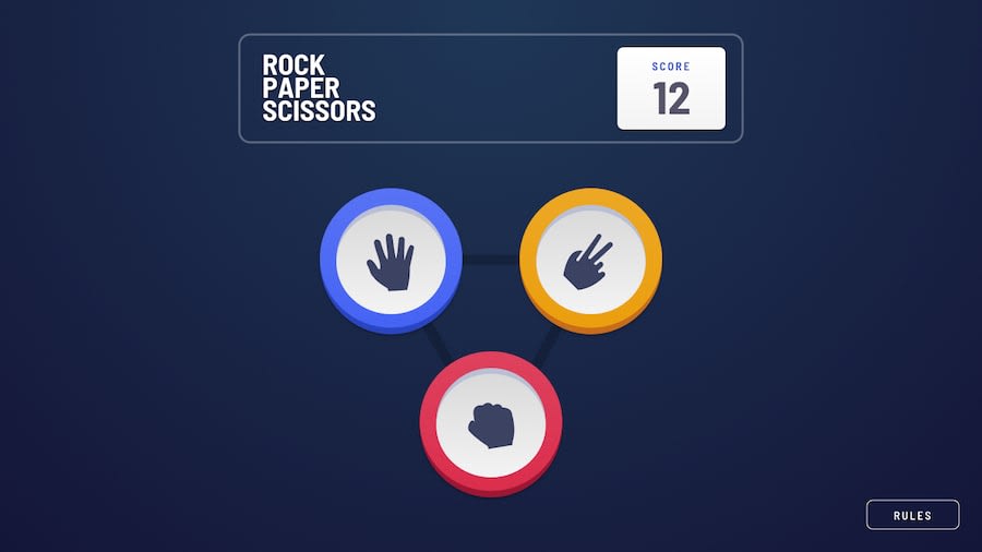
Rock-Paper-Scissors game with React, Redux, and Material UI

@KMArtwork

Design comparison
SolutionDesign
Solution retrospective
- How would you improve this?
- Is there anything that I did poorly / inefficiently?
- Any general feedback / comments / questions?
Community feedback
- @erlynascaratePosted over 1 year ago
Hello, It overflows a bit horizontally between 500px and 885px (I don't know how to fix it, sorry)
Also, it overflows vertically (when the screen is less than 740px). You could do this:
min-heightinstead ofheight#gamescreen{ ----min-height: calc(100vh - 4rem); ----padding: 2rem; ----text-align: center; ----background: $BGGradient; ----display: flex; ----flex-direction: column; ----justify-content: space-between; ----align-items: center; }@media(min-width: $breakpoint-mobile){ ----#gamescreen{ --------min-height: calc(100vh - 6rem); --------padding: 3rem; ----} ----/* ....*/ }0

Please log in to post a comment
Log in with GitHub
Join our Discord community
Join thousands of Frontend Mentor community members taking the challenges, sharing resources, helping each other, and chatting about all things front-end!
Join our Discord