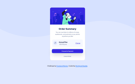
I managed to complete this challenge in an hour. However, I have the doubt if it is possible that the color of the button text be the same as the background of the card without having to specify it directly. It's possible?
Hector Sánchez Coronel
@encoreOaxAll comments
- @encoreOaxSubmitted about 3 years ago@encoreOaxPosted about 3 years ago
Thank you very much for your comments!
I think you are right about the section elements. Taking into account that this element can be part of a larger project, the most logical thing is that this part is a complete section. As for the h1 element I had not considered making the element available to screen readers, but I will follow the guide you provide to add it, because it is something important. I designed the change in design between mobile and desktop so that the design of the card did not change at any time, since I realized that the last word of each paragraph was intended to remain alone and altering the design in an intermediate step was It lost the effect, I also wanted to avoid stacking two elements on top of the third, but I will try to think of a creative way to generate an intermediate state that maintains the design.
Do you think my code is easy to read?
Thank you again for your comment.
1 - @samuelsmith442Submitted about 3 years ago
This is my first solution so it may need some work any feedback would be helpful
@encoreOaxPosted about 3 years agoHi Samuel! Your desktop solution looks awesome! You really nail it here. Unfortunately the mobile version breaks, I struggle the same way at the beginning. I suggest start with the mobile version first and then go to the desktop, it will help you to see miss matches. Keep it up with you great work!
Marked as helpful0 - @adrianangSubmitted about 3 years ago
Hey everyone! For this challenge, I mainly wanted to practice taking a mobile-first approach to CSS styling after reading about some current best practices in web development.
I'd love to hear any feedback that you might have, especially with regards to any possible oversights in my project on accessibility, "best practices" to follow, or details!
Updates (since initial submit):
- added background color
- edited hover and active states of the 'Learn More' links
- removed alt text from (decorative) icons
@encoreOaxPosted about 3 years agoHello Adrian. I like your solution, I think you achieved the overall design very well. I consider that some elements of the design were missing, such as the background color and the hover effect of the buttons does not correspond to the one indicated. I consider that for this project it is important that the mobile design looks as required so that the semantics of the text message can be appreciated. Keep up your excellent work!
0 - @arshGoyalDevSubmitted about 3 years ago
Any suggestions would be great!
@encoreOaxPosted about 3 years agoHi You code is very well organized, mine was chaotic! This solution looks awesome and I like it, the only thing is the movile menu animation, is a little distracting, but everyting else is great!
Marked as helpful0 - @mdajmalshadabSubmitted about 3 years ago
This was my first challenge, my first self made web page, I am a beginner. How can I further improve my skills?
@encoreOaxPosted about 3 years agoHi! Great first one! I like the responsiveness. Go ahead and take a new challenge!
0


