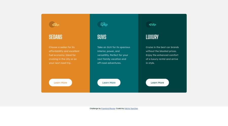
Design comparison
Solution retrospective
I managed to complete this challenge in an hour. However, I have the doubt if it is possible that the color of the button text be the same as the background of the card without having to specify it directly. It's possible?
Community feedback
- @pikapikamartPosted about 3 years ago
Hey, great job on this one. Layout in desktop is really good, the mobile state is great as well. Though it is too early for mobile transition, you could have used more of those screen size for the desktop layout.
- I don't think you can, you will always need to specify the
color
property of thebutton
element to change it.
Some other suggestions would be:
- You don't need to use
section
to wrap each card.section
is used to group related content or elements, and since those cards are related to one another, a 1section
that wraps all of them would be much better. - The
alt
for each carimg
should be left empty likealt=""
, since those are just decorative images, no need to give text for them. - Always have an
h1
element on a webpage. For this one, theh1
would be a screen-reader only text. Have a look at Grace's solution on this one, inspect the layout and see how she used theh1
and copy her css stylings for that card, that will be yoursr-only
class stylings.
Aside from those, the layout looks really great. If you have queries about something, just drop it here okay and maybe I can help as long as I know.
Marked as helpful0 - I don't think you can, you will always need to specify the
- @encoreOaxPosted about 3 years ago
Thank you very much for your comments!
I think you are right about the section elements. Taking into account that this element can be part of a larger project, the most logical thing is that this part is a complete section. As for the h1 element I had not considered making the element available to screen readers, but I will follow the guide you provide to add it, because it is something important. I designed the change in design between mobile and desktop so that the design of the card did not change at any time, since I realized that the last word of each paragraph was intended to remain alone and altering the design in an intermediate step was It lost the effect, I also wanted to avoid stacking two elements on top of the third, but I will try to think of a creative way to generate an intermediate state that maintains the design.
Do you think my code is easy to read?
Thank you again for your comment.
1@pikapikamartPosted about 3 years ago@encoreOax Awesome!
I checked you css in your repo and it looks fine in there. Specificity is at 1 or 2 level which is fine/great. Though you don't really need to add those comments about each property values, since the name of your variables already describes its usage. But I would keep those comment about sectioning css that you made, like "general styling for various elements" I would keep those, I them as well :>
Just another suggestion, to avoid having to type out multiple selector just to target an element, you can use
.scss
orsass
. This will really help you out. This is just regular css but some many features on it. Have a look on it and you will definitely use it.Marked as helpful0
Please log in to post a comment
Log in with GitHubJoin our Discord community
Join thousands of Frontend Mentor community members taking the challenges, sharing resources, helping each other, and chatting about all things front-end!
Join our Discord