Not Found
Not Found
Not Found
Not Found
Not Found
Not Found
Not Found
Not Found
Not Found
Not Found
Not Found
Not Found
Not Found
Not Found
Not Found
Not Found
Not Found
Not Found
Not Found
Not Found

All comments

  • @Juanescacha

    Submitted

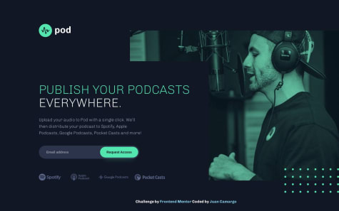
    This challenge represents a new solution proposed as an improvement to the corrections mentioned in my initial attempt by @jairovg. I focused on enhancing accessibility (A11Y) and conducted audit using the ChromeVox extension to observe how a Screen Reader navigates through the page. Additionally, I performed an audit using the Lighthouse tool to assess both accessibility and DOM semantics.

    I modularized the application's components and defined their styles in each Single File Component (SFC) to ensure easy reusability. I applied the BEM methodology and utilized SCSS for enhanced synergy.

    I would appreciate feedback on this solution. If there are opportunities for improvement or if there are better practices that can be employed, please let me know!

    @edward-montoya

    Posted

    Nice job. I see you have implemented all the Jairo's suggestions. Now, looks better and more organized.

    • I don't like the h1 divided in two pieces, probably the screen readers are smart enough to share with the user the right name. However, I prefer a "hidden" solution to separate the title from the h1 (optional).
    • The modifiers of the streaming companies are defined in a wrong way. Since, you are using BEM as class naming methodology, you are using the syntax main__item-google, however, the correct syntax is main__item--google.
    • Instead of using aria-hidden in the images, I think, it is more clear if you just use alt="". Both options tell the screen readers that the image is decorative.

    Marked as helpful

    1