-
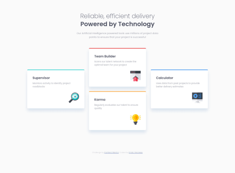
I am facing an issue with setting up Media Queries to change the border radius of each column as screen size changes but it is not working. Please give me feedback as to how can I do that.
-
I'd love to know if I have written clean code and written which was not required.
DroopyDev
@droopydevAll comments
- @aviralsharma07Submitted about 2 years ago@droopydevPosted about 2 years ago
Hi Aviral Sharma!
- "I'd love to know if I have written clean code and written which was not required."
One of the ways to write clean and understandable CSS code is to apply the BEM naming convention.
For example, in your CSS styling, when a person reads ".card1", ".card2" etc, they may not know which card you are referring to. So to make it easily understandable, you can do.
".card--sedan", ".button--suvs"
You can read more about it here: https://css-tricks.com/bem-101/
Marked as helpful1 - @Scott-WilderSubmitted almost 3 years ago
How did you get the text "sedan, suvs, and luxury" to be as tall? I did a y-axis transfom.
@droopydevPosted almost 3 years agoHey Scott! For the buttons, using the native HTML <Button> element is a much suitable choice as it provides a semantic meaning as compared to creating a button using div. I see that you also repeated CSS properties across 3 different classes (.button1 .button2 .button3). A better way is since all three buttons has the same .button class, you can write the same CSS properties (padding: 1em 2em) for that class and it will be applied to all 3 buttons.
Marked as helpful0 - @E1000oSubmitted almost 3 years ago
Any comments appreciated. Thanks in advance.
- @mayank-2323Submitted almost 3 years ago
Hi,
Is there any way I can make all 3 buttons come in a single line across the 3 columns? Also, can I make the code any more Responsive? I want to make it as Responsive as possible.
@droopydevPosted almost 3 years agoHey Mayank! To make all 3 buttons be in the same horizontal line is to have them all align to the bottom. That's because the text content (the p tag) can be dynamic and have different heights, but the button will always be at the bottom. Currently, the height of the .card-para across the 3 cards are different. Make It flex so that its height takes up the whole remaining vertical space
0 - @prajwal18Submitted about 3 years ago
Can someone review my work and give feedback, best practices, how you would do certain aspects differently. Any feedback would be highly appreciated.
@droopydevPosted about 3 years agoI didn't know you can actually add multiple backgrounds to an element using the background-image property, learnt something new today by looking through your code. Awesome! I'm aware that the challenge has only one card, but I'd personally contain the component in its own div instead of using the <main> tag, just so that I can duplicate the card component again and again, like how cards are usually used in some websites.
Also, the "803K Likes" is not truly centred. That's because even though you used justify-content: space-around to distribute the space evenly, the 3 flex items have different widths.
0


