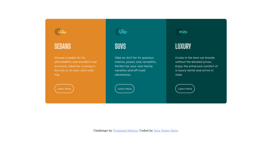
Responsive 3 Column Preview card using Flexbox
Design comparison
Solution retrospective
-
I am facing an issue with setting up Media Queries to change the border radius of each column as screen size changes but it is not working. Please give me feedback as to how can I do that.
-
I'd love to know if I have written clean code and written which was not required.
Community feedback
- @droopydevPosted almost 2 years ago
Hi Aviral Sharma!
- "I'd love to know if I have written clean code and written which was not required."
One of the ways to write clean and understandable CSS code is to apply the BEM naming convention.
For example, in your CSS styling, when a person reads ".card1", ".card2" etc, they may not know which card you are referring to. So to make it easily understandable, you can do.
".card--sedan", ".button--suvs"
You can read more about it here: https://css-tricks.com/bem-101/
Marked as helpful1@aviralsharma07Posted almost 2 years ago@droopydev Thank You for telling me this. I'll name classes according to the BEM convention from now onwards.
1 - @AbibGuardian50Posted almost 2 years ago
Hi Aviral Sharma! Congrats on your achievement to complete this challenge
Before the answer,you could read about css shorthand on border radius and @media screen rule in https://www.w3schools.com/cssref/css3_pr_border-radius.php and https://www.w3schools.com/cssref/css3_pr_mediaquery.php First,to change the border radius as screen size changes,you need to know which border you want to change. You can use this on your code @media all and (max-width: 600px) { .card1{ border-radius: 10px 10px 0px 0px; } .card2{ border-radius: 0 0 0 0; } .card3{ border-radius: 0 0 10px 10px; } }
And then,you can delete @media all and (max-width: 1023px).
Is there any question,please ask and correct me if im wrong Thank You!
Marked as helpful0@aviralsharma07Posted almost 2 years ago@AbibGuardian50 Thank You. It helped. I didn't realise that (max-width:1023px) was overwriting (max-width:600px).
0 - @AdrianoEscarabotePosted almost 2 years ago
Hi Aviral Sharma, how are you? I really liked the result of your project, but I have some tips that I think you will enjoy:
To align some content in the center of the screen, always prefer to use
display: flex;
it will make the layout more responsive!Example:
body { margin: 0; padding: 0; display: flex; align-items: center; flex-direction: column; // just if the body has two child justify-content: center; min-height: 100vh; }
The rest is great!
I hope it helps... 👍
1 - @Oakwood811Posted almost 2 years ago
Implement a Mobile First approach 📱 > 🖥
With mobile devices being the predominant way that people view websites/content. It is more crucial than ever to ensure that your website/content looks presentable on all mobile devices. To achieve this, you start building your website/content for smaller screen first and then adjust your content for larger screens.
-this feedback was from a developer but I want to share how to think when you start your next project
1@aviralsharma07Posted almost 2 years agoHey, @Oakwood811 Thanks for this valuable insight. Can you suggest some general practices or maybe resources that have helped you to take a mobile-first approach to your projects?
0
Please log in to post a comment
Log in with GitHubJoin our Discord community
Join thousands of Frontend Mentor community members taking the challenges, sharing resources, helping each other, and chatting about all things front-end!
Join our Discord