Don Delice Dushime
@dondelice257All comments
- @mukozi257Submitted over 1 year ago@dondelice257Posted over 1 year ago
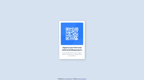
Great job but you can try increase the height of the container so that it should look as the same as the one of the challenge
Marked as helpful1 - @zachtixSubmitted over 1 year ago
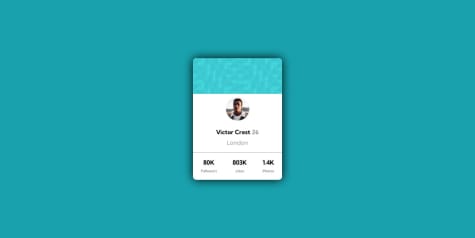
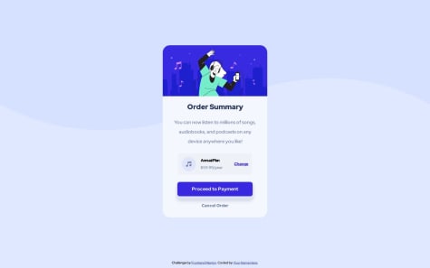
help teach me, avatar position not correct and BG.
@dondelice257Posted over 1 year agoGood job ! but you can try to increase the width of the container so that it can look as a desktop design because now it looks as a mobile design Mark my comment as helpful if it's, please !
Happy coding !
0 - @ManikMaitySubmitted over 1 year ago
- I find it difficult to center the card in the body. Though I did it somehow.
@dondelice257Posted over 1 year agoyou did it well, to center the div automatically you can use margin:auto and height:100vh
0 - @PJ-ElujideSubmitted over 1 year ago@dondelice257Posted over 1 year ago
You did it well, no more comments, keep improving your skills
0 - @SparrowHawkEyeSubmitted over 1 year ago@dondelice257Posted over 1 year ago
Perfect job, but you can try to increase the border radius of the container with some px
Marked as helpful0 - @mvergara94Submitted over 1 year ago
I think this exercise is one of my bests so far, If anyone can give me ideas of how to improve this project using JS or some other thecnology please let me know.
@dondelice257Posted over 1 year agoNo more feedback ! you did it perfectly, keep going on
1 - @Neohugh21Submitted over 1 year ago
This its my first try to put my web design online, so i start with a tutorial about this exercises. But i'll try to give my best only using my experience on html, css and js.
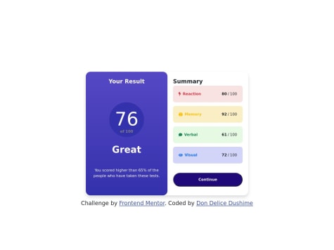
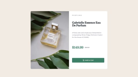
@dondelice257Posted over 1 year agoPerfect work, but you can try to make a white background on the right side also reduce the button so that it can look so nice
Marked as helpful1 - @mark-pherzSubmitted over 1 year ago
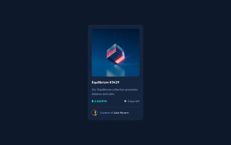
Will be grateful to receive a feedback. Especially about cursor hover main image effect, when picture kinda fades out a bit and "view" image also appears on the center.
A have achieved needed result but I'm pretty sure there is more sophisticated way to do that.
@dondelice257Posted over 1 year agoOkay but it's not a hard-code at all, but you can try using {display:flex; justify-content:center} on the container and {margin: auto} on the element inside a container, this also centers an element inside a container
Marked as helpful1 - @mark-pherzSubmitted over 1 year ago
Will be grateful to receive a feedback. Especially about cursor hover main image effect, when picture kinda fades out a bit and "view" image also appears on the center.
A have achieved needed result but I'm pretty sure there is more sophisticated way to do that.
@dondelice257Posted over 1 year agoPerfect work, you can improve by making a shaddow on the section so that the users can see easly the limit of this section, also in frontend everything has signification ( what does the eye icon do ? i clicked it but nothing changed )
0
