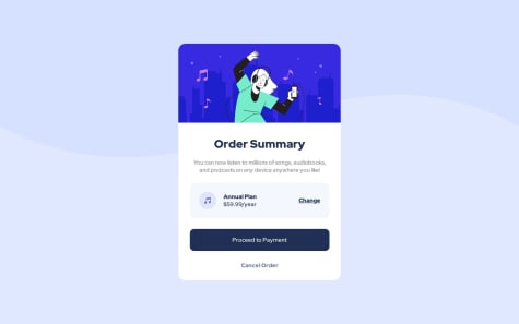
Feedback are welcome!
devendra
@devendra-altAll comments
- @Anuoluwapo-devSubmitted over 1 year ago@devendra-altPosted over 1 year ago
Hello @Anuoluwapo-dev
Great work, Design looks exactly the same.
I have some suggestions for you
-
You can use
<artical>tag instead of the normaldivtag (for order summary card) it will make your code more semantic which is also good practice from accessibility and SEO standpoint. -
Please use the
<alt>attribute on<image>it will make your code more accessible to screen readers, also it will make your site more SEO friendly.
Happy Coding :)
0 -
- @CorinaMurgSubmitted over 1 year ago
Hi Everyone,
I am learning React and I picked this easy challenge to practice my skills, but now I’m a bit distracted by its design. The original design is beautiful but it does not meet the contrast ratio guidelines, so I wanted to try out different shades of green. The page does pass the contrast ratio test now, but the design is less … appealing.
Questions: Do you find my design acceptable? If not, what would you change? Would it work better if I replaced the green with a different color?
I completed this version with just plain HTML and CSS, but would like to try a different color scheme with the React version.
Thank you in advance for you feedback!
@devendra-altPosted over 1 year agoHello @Cor-Ina, Great Work,
I have some suggestions for you,
- you can add
box-shadowto the infocard. - you can use the
<article>tag in place of<main class="price"><main/>, it was a better choice from the website accessibility point-of-view. - you can use descriptive class names to make your code more maintainable and consistent.
Marked as helpful1 - you can add

