@rsantanacatalanSubmitted about 3 years ago
Hello Community
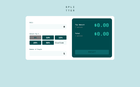
This my first app with React, I would appreciate your feedback. I enjoyed building the solution :)

Hello Community
This my first app with React, I would appreciate your feedback. I enjoyed building the solution :)
Great job, it's exactly like the design. There are some broken link to svg files. Don't know if you could check them. The custom percentage seems like it's not working properly.
hi I'm having problems with my media query, i can't seem to get it to work in flex-direction:column.
i understand another alternative will be to use flexbox grid, but i would like to figure out why my code isn't working for mobile.
any solutions or suggestions are welcome, thank you!
Watched the code and your problem on flex-direction: column; in your master branch you didn't change the value:
.flexbox {
  height: 100vh;
  width: 100vw;
  max-width: 1440px;
  display: flex;
  justify-content: center;
  align-items: center;
  flex-direction: row;
  flex: 1 2 1080px;
  margin: auto;
}

@media screen and (max-width: 375px) {
  .flexbox {
    flex-direction: row; // this value need to be column
  }
}