Design comparison
SolutionDesign
Solution retrospective
Hello Community
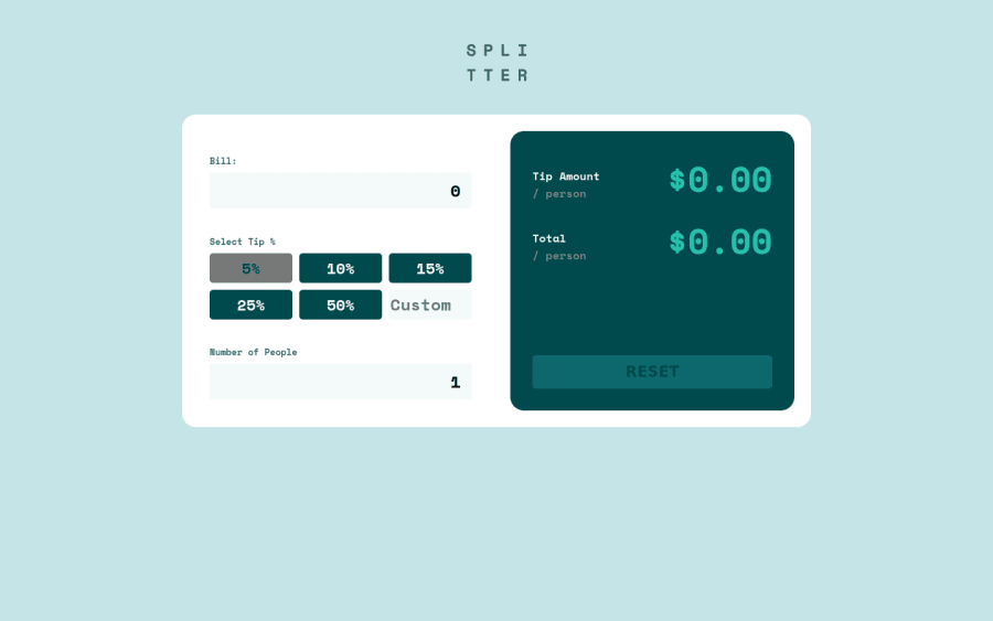
This my first app with React, I would appreciate your feedback. I enjoyed building the solution :)
Community feedback
- @despotesPosted over 3 years ago
Great job, it's exactly like the design. There are some broken link to svg files. Don't know if you could check them. The custom percentage seems like it's not working properly.
Marked as helpful1 - @hafizanadliPosted over 3 years ago
- For better ux, in first load, when user focus on the input (bill or number of people) and type number it will be better if they do not have to delete the current value first. You could give it a placeholder instead of give initial value.
- You can hide arrows button for number input, it looks cleaner.
other than that, the functionality working well and responsive. Keep up the great work!
0 - @ChamuMutezvaPosted over 3 years ago
- validate for zero and less numbers.
- input elements should have a label, well some inputs (radio) have buttons but here is an eg of an input missing a label
<input placeholder="Custom" type="text" className=""></input> - an empty alt value is written as
alt="". The following is not an empty valuealt=" "
0
Please log in to post a comment
Log in with GitHubJoin our Discord community
Join thousands of Frontend Mentor community members taking the challenges, sharing resources, helping each other, and chatting about all things front-end!
Join our Discord
