Not Found
Not Found
Not Found
Not Found
Not Found
Not Found
Not Found
Not Found
Not Found
Not Found
Not Found
Not Found
Not Found
Not Found
Not Found
Not Found
Not Found
Not Found
Not Found
Not Found

All solutions

  • Submitted


    What are you most proud of, and what would you do differently next time?

    I have now done this on a few projects and am getting much more comfortable mapping arrays to my HTML elements within my Astro components. Part of why I love HTML and CSS is the separation of information from presentation. Using frontmatter/prop data allows me to break the information itself away from the HTML, giving me information, structure, and style as three separate elements in my web design. I also worked hard to use semantic HTML, ensure type safety, use logical CSS, and minimize any hard breakpoints. Almost did this without any media queries!

    What challenges did you encounter, and how did you overcome them?

    My initial goal was to complete this recipe challenge without any media queries. This challenge was trickier than earlier ones because padding and border radius style adjustments were needed between mobile and desktop. Font size can be handled with fluid typography and layout with some flex/grid displays. This was my first time trying to do padding or border radius without a media query.

    In the end I broke down and used both a container query and a media query. I had a few functioning versions of what I needed, but the CSS felt a bit hacky and far less clear than just using a query.

    What specific areas of your project would you like help with?

    I am new to container queries. I used one on my RecipeImage.astro component as well as a media query on my Card.astro primary component. I would love feedback on how to properly use container queries, including shift my media query into a container query. I couldn't get mine working and was tired of troubleshooting so just used a media query. When I tried to use a container query on Card.astro similar to how I did it on RecipeImage.astro, my entire card lost all proportions and became a long vertical stick.

    Also let me know if you see ways I can improve the semantic HTML, type safety, or logical CSS. So much to learn and remember to implement!

  • Submitted


    What are you most proud of, and what would you do differently next time?

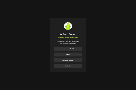
    I am most proud of avoiding any media queries and emphasizing type safety within my Astro components. The Card.astro component makes changes to the name, location, bio, and profile image easy without digging into the code. Similarly, the Links.astro component iterates over a list of string-based link/label pairs, allowing additional links to be added or removed with ease.

    What challenges did you encounter, and how did you overcome them?

    I am still getting comfortable with TypeScript so I have to regularly look at reference material and my old projects. At this point TS is primarily for type safety as I read JSON data to map to HTML elements in my components.

    What specific areas of your project would you like help with?

    Nothing in particular but I welcome feedback.

  • Submitted


    What are you most proud of, and what would you do differently next time?

    I am most proud of turning this into a reusable component. A main point driving my interest in Astro is being able to use basic web dev tools (HTML, CSS, JS) to create reusable components. Next time I would make the category tag ("Learning") a list so that multiple categories could be used, generating a new category button for each entry. This would make the component that much more modular for future use.

    What challenges did you encounter, and how did you overcome them?

    Even though I used dynamic images within my QR code component, I struggled to get that working here. I still don't know if it was an undiscovered typo or another issue but it took several attempts to get the image path properties of my card component to work as intended. When I ran into issues, I scaled back what I was trying to do at once to find the issue. I created a new alternative test component without type safety and that didn't limit the types of images. Once I had a basic version working as I started adding back in the other features.

    What specific areas of your project would you like help with?

    Nothing in particular but feedback is appreciated. My overall focus is to prioritize responsive, reusable components without employing media queries. I am new to JavaScript/TypeScript so let me know if something regarding the frontmatter scripts or type safety seems off. Those are mostly from adapting examples in the Astro docs.

  • Submitted


    What are you most proud of, and what would you do differently next time?

    I am most proud of of creating a personal design system that can be reused across future FM challenges. Next time I want to build my component to be resizable from the beginning, with the design parameters providing the default values.

    What challenges did you encounter, and how did you overcome them?

    I struggled with layering images. In the past I have done this with absolute position but I wanted something that felt less...janky. SmolCSS had me covered with their stack layout and an excellent linked use-case article on hero layouts.

    What specific areas of your project would you like help with?

    I am pretty new to JavaScript and TypeScript. I tried to make this entire project type safe to minimize issues both in component use and use of the site.json information. I am cobbling together information from many sources and trying to adapt to Astro's implementation so please hit me up with anything that looks like an incorrect or inadvisable approach.