Skip to content
Learning paths
Challenges
Solutions
Articles
Unlock Pro
Log in with GitHub
Profile
Overview
Solutions
26
Comments
1
bilguun1130
@bilguun1130
Follow
All solutions
Submitted 11 months ago
Advice Generator App in React
HTML
CSS
JS
API
0
2
0
Submitted 11 months ago
Expense chart component react and tailwind css solution
HTML
CSS
JS
1
2
0
Submitted about 1 year ago
Tip Calculator App
HTML
CSS
JS
1
6
0
Submitted about 1 year ago
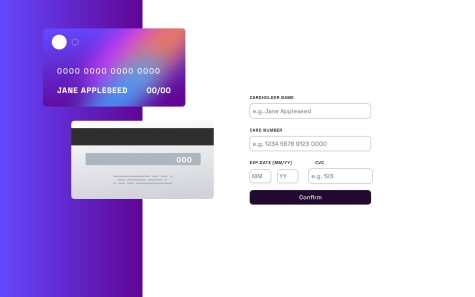
Interactive card details
HTML
CSS
JS
0
2
1
Submitted about 1 year ago
News Home Page Solution. Almost No JS.
HTML
CSS
JS
0
4
0
Submitted about 1 year ago
Age Calculator App with counter animation effect
HTML
CSS
JS
0
1
0
Submitted about 1 year ago
Age Calculator App with counter animation effect
HTML
CSS
JS
0
1
0
Submitted about 1 year ago
News Letter Sign Up with Success message
HTML
CSS
JS
0
4
0
Submitted about 1 year ago
News Letter Sign Up with Success message
HTML
CSS
JS
0
3
0
Submitted about 1 year ago
Fylo landing page with 2 column layout
HTML
CSS
0
5
0
Submitted about 1 year ago
Huddle landing page with alternating feature blocks
HTML
CSS
0
4
0
Submitted about 1 year ago
Clipboard Landing Page solution
HTML
CSS
0
3
0
Submitted about 1 year ago
Testimonials grid
HTML
CSS
0
5
0
Submitted about 1 year ago
Fylo Data Storage Component
HTML
CSS
0
4
0
Submitted about 1 year ago
Huddle landing page with a single intro section
HTML
CSS
0
5
0
Submitted about 1 year ago
Single price grid component
HTML
CSS
0
5
0
Submitted about 1 year ago
Four card feature section
HTML
CSS
0
5
0
Submitted over 1 year ago
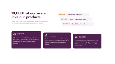
Social Proof Section
HTML
CSS
0
4
0
Submitted over 1 year ago
Profile card component
HTML
CSS
0
5
0
Submitted over 1 year ago
3column preview card component solved with flex
HTML
CSS
0
5
0
Submitted over 1 year ago
Stats texts don't look as it is on the picture
HTML
CSS
0
3
0
Submitted over 1 year ago
Order Summary Component
HTML
CSS
1
2
0
Submitted over 1 year ago
NFT preview card component
HTML
CSS
2
6
0
Submitted over 1 year ago
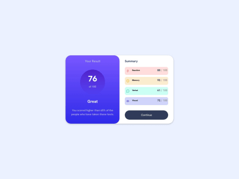
Result-Summary-Component solution
HTML
CSS
0
4
0
Load more
